
Mosaiq’s Key Performance Indicator (KPI) dashboard offers an overview of your transport network’s performance. Track key metrics like data quality, punctuality, reliability, and performance over time.
Quickly identify top and underperforming operators or services to drive continuous improvements.
The dashboard always defaults to having the Punctuality tab open.
By default Mosaiq Insights includes the following three default KPIs: Punctuality, Reliability, and Distance run. To request KPIs specific to your organisation’s needs, please contact support.
Viewing and analysing network performance
-
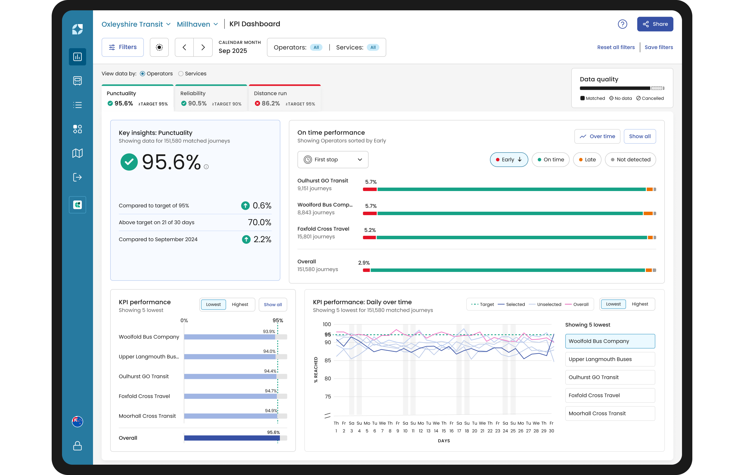
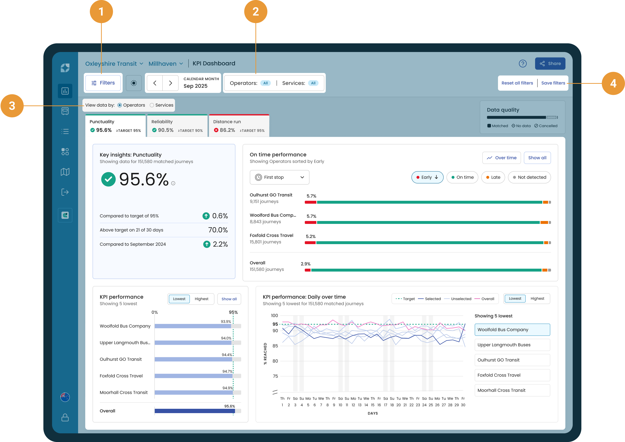
On first opening Mosaiq Insights, the date range is preset to show the last 28 days for which we have the most recent data. Click on the filter hub to select a specific date range (or time range) to view (1).
-
Click on either the filter hub or operators/services button to select which operator/s and service/s to include (2), and toggle how you want to view the data you’ve selected on the dashboard – either by operators or services (3).
It is possible to view the performance of a subset of services for an operator. For example, if you remove all school services from an operator, Mosaiq will display the performance for that operator excluding school services run by that operator.
-
Select “Save filters” to keep these settings for later (4).
Performance data divided by KPI tabs
Depending on the selections made within the filter hub, you’ll see an overview of the historical performance of your network, broken down first by your Key Performance Indicators (KPIs).
The KPI tabs let you quickly assess your network's performance. Each tab shows:
-
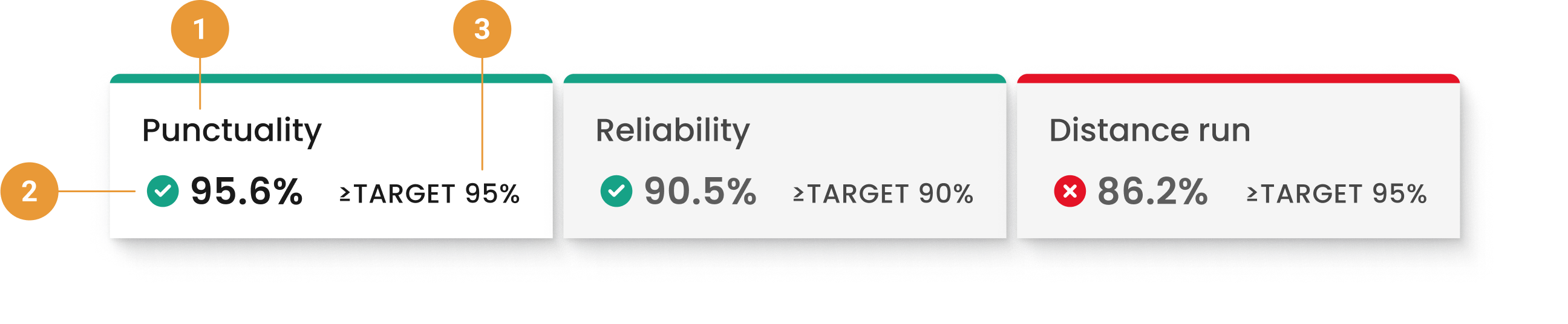
KPI name (1)
-
KPI value - The value based on your filter selections (2)
-
KPI target - The target determines if the KPI meets your contractual obligations (3). Mosaiq Insights uses colour (green or red) to indicate KPI success or failure.
Click a KPI tab to view relevant insights based on your filters. These insights provide an overview of potential failure causes.
The order in which your KPIs are assigned to tabs is determined at onboarding. The dashboard always defaults to having the first KPI tab open. This will always be Punctuality if you are using Mosaiq’s default KPIs. Refer to How KPIs are calculated for more detail.
The KPI charts
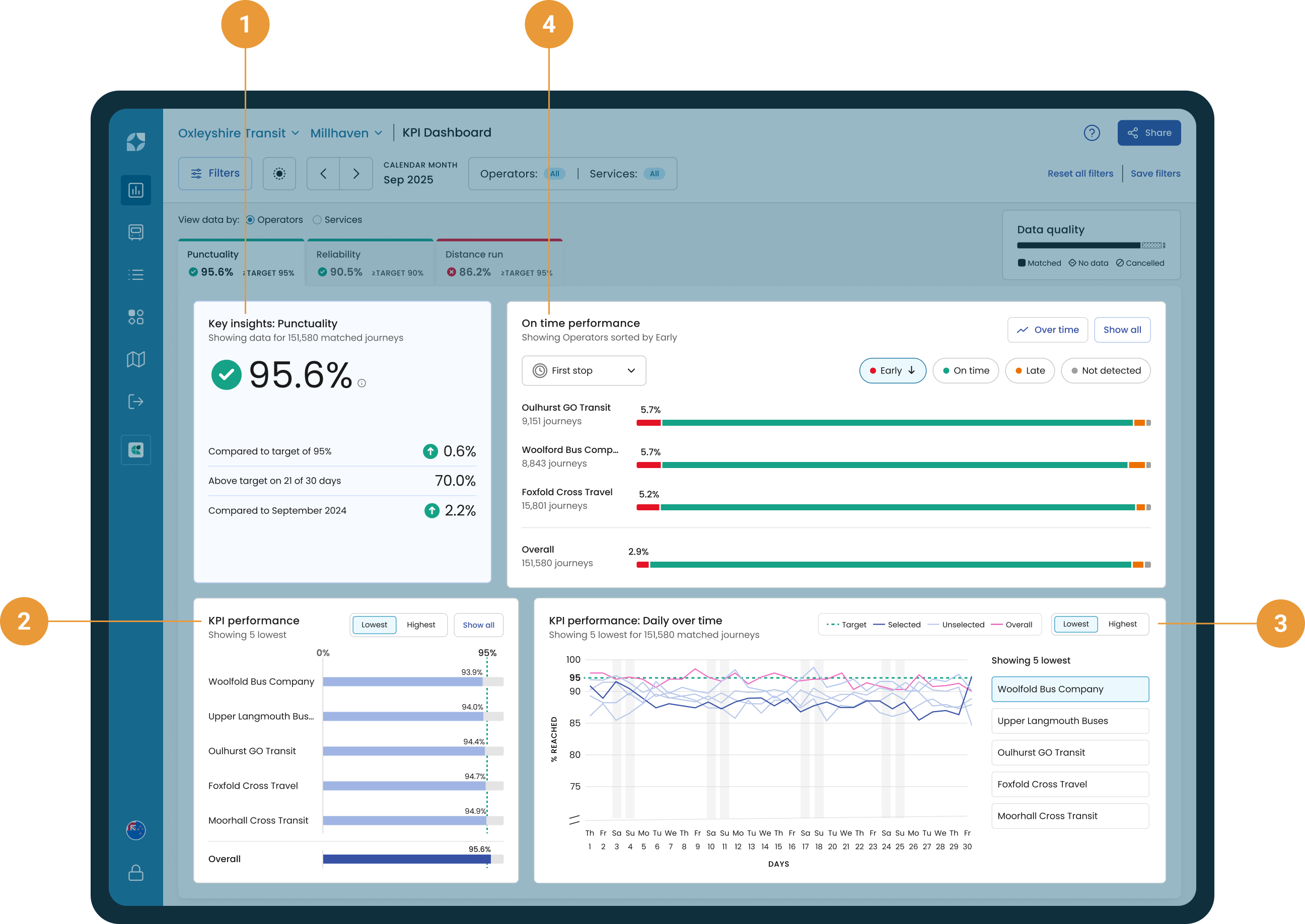
The chart section of the KPI tabs is designed to give you an overview of what the potential causes of failure could be, based on your selected filters.
-
Key insights displays a high-level summary of the performance of your selected KPI compared to the target and the last period (1).
-
KPI performance highlights the five highest and lowest performing operators or services (2).
-
KPI performance daily over time displays daily KPI data for the five highest or lowest performing operators or services over a selected period of time (3).
-
On time performance is displayed on the KPI dashboard for any punctuality-based KPI. It highlights early, on-time, and late (EOL) performance of operators or services (4).
Click on an operator or service name within the KPI performance and/or On time performance charts to dive deeper into the data.
Example: Passing or failing a KPI
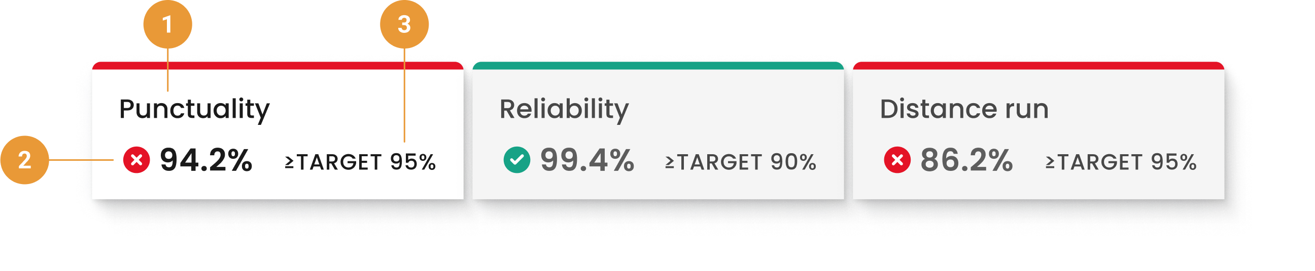
For the selected filters, the:
-
Punctuality KPI has a value of 94.2%. It is failing to meet the target needed to pass this KPI (≥95%) as it is below 95%, as indicated by the red line at the top of the tab and the cross icon next to the KPI value.
-
Reliability KPI has a value of 99.4%. It is above the target needed to pass this KPI (≥90%), as indicated by the green line at the top of the tab and the tick icon next to the KPI value.
-
Distance run has a value of 86.2%. It is failing to meet the target needed to pass this KPI (≥95%), as indicated by the red line at the top of the tab and the cross icon next to the KPI value.