
The Reliability failure indicator chart helps pinpoint areas of your network where timing points are failing.
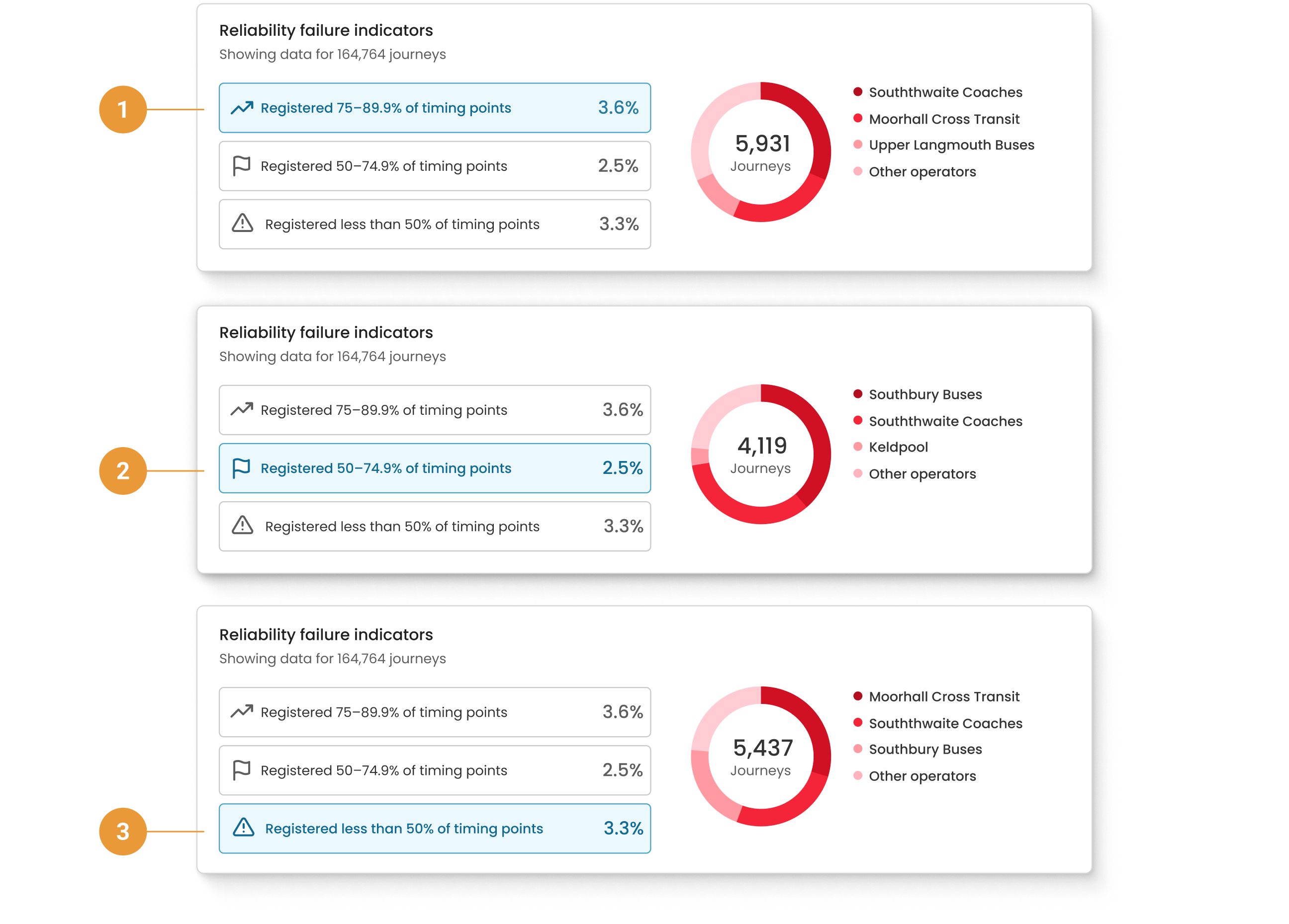
Category 1 is always pre-selected, and the donut chart to the right reflects the data specific to the category selected on the left.
The different levels of failure have been summarised and are shown on the buttons on the left:
-
Registered 75-89.9% of timing points (1)
-
Registered 50-74.9% of timing points (2)
-
Registered less than 50% of timing points (3)
Example
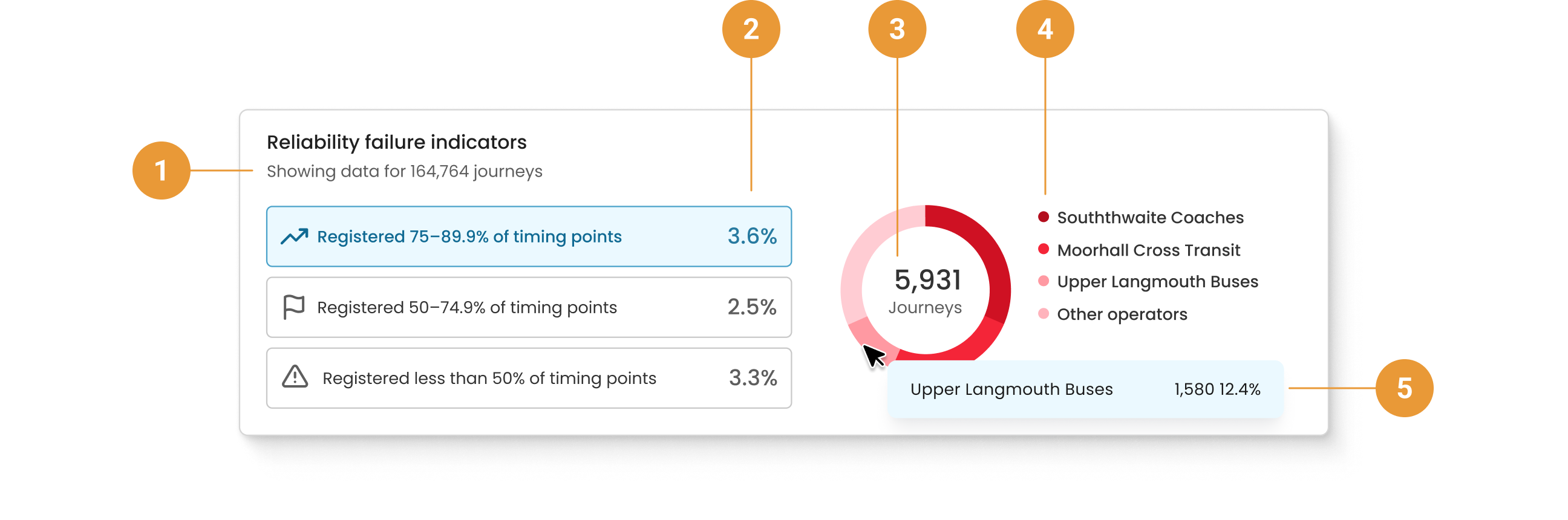
Of the data collected for 164,764 scheduled journeys (1), 3.6% of the journeys “registered at 75-89.9% of timing points” (2). As this category is selected, we can see in the donut chart to the right that 3.6% equates to 5,931 journeys (3). We can also see the top four operators contributing to the performance data, with their percentage contributions indicated on the donut chart (4).
Hovering over the donut sections reveals the operator name, journey count and percentage contribution to the whole (5).