
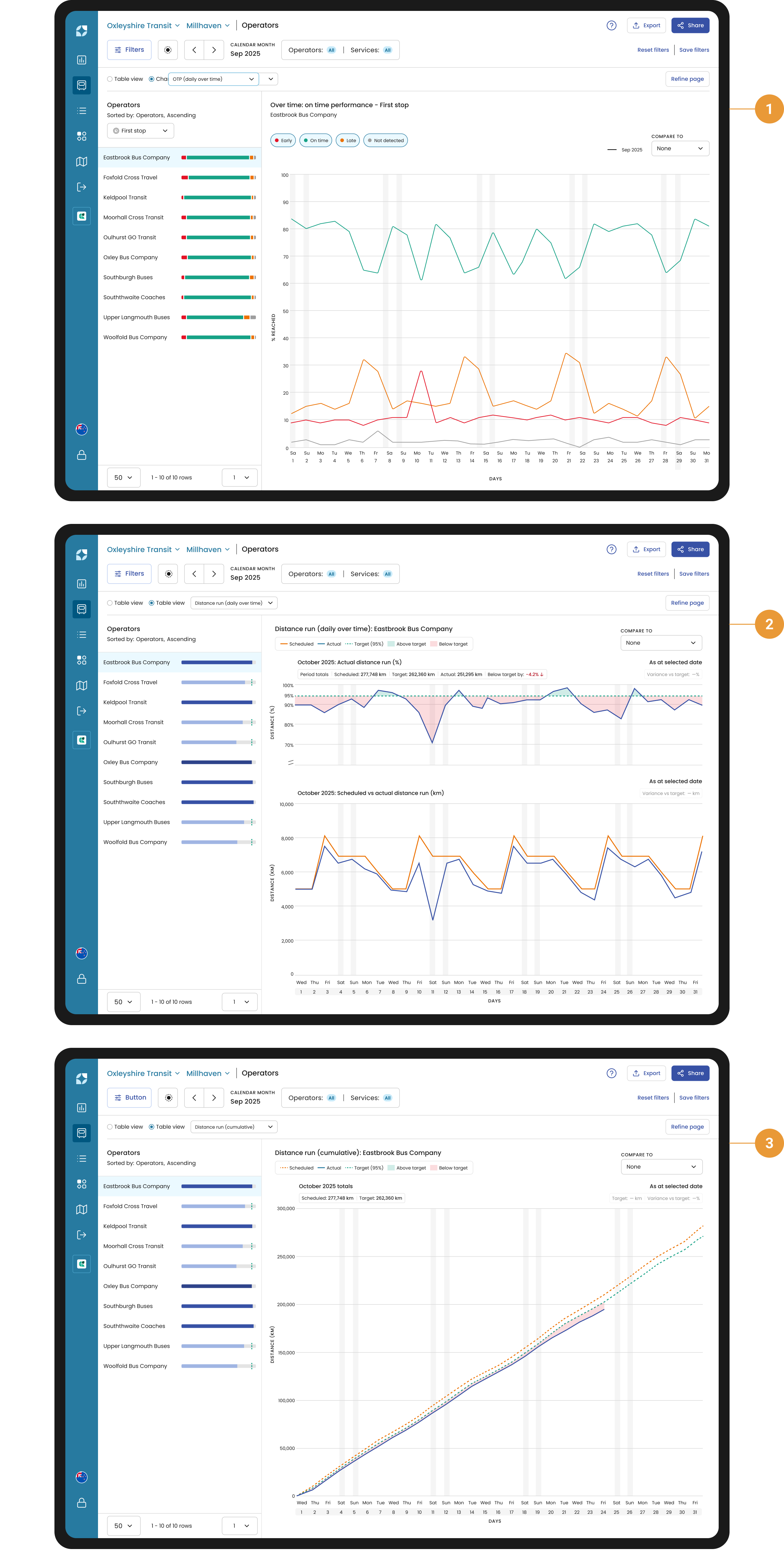
The Chart view provides a visualisation of Operator / Service performance and can be used to compare past time spans to the current selection. These charts include On-time Performance (daily over time), Distance run (daily over time) and Distance run (cumulative). Each provide a detailed view into the operator / service performance for the period you have selected.
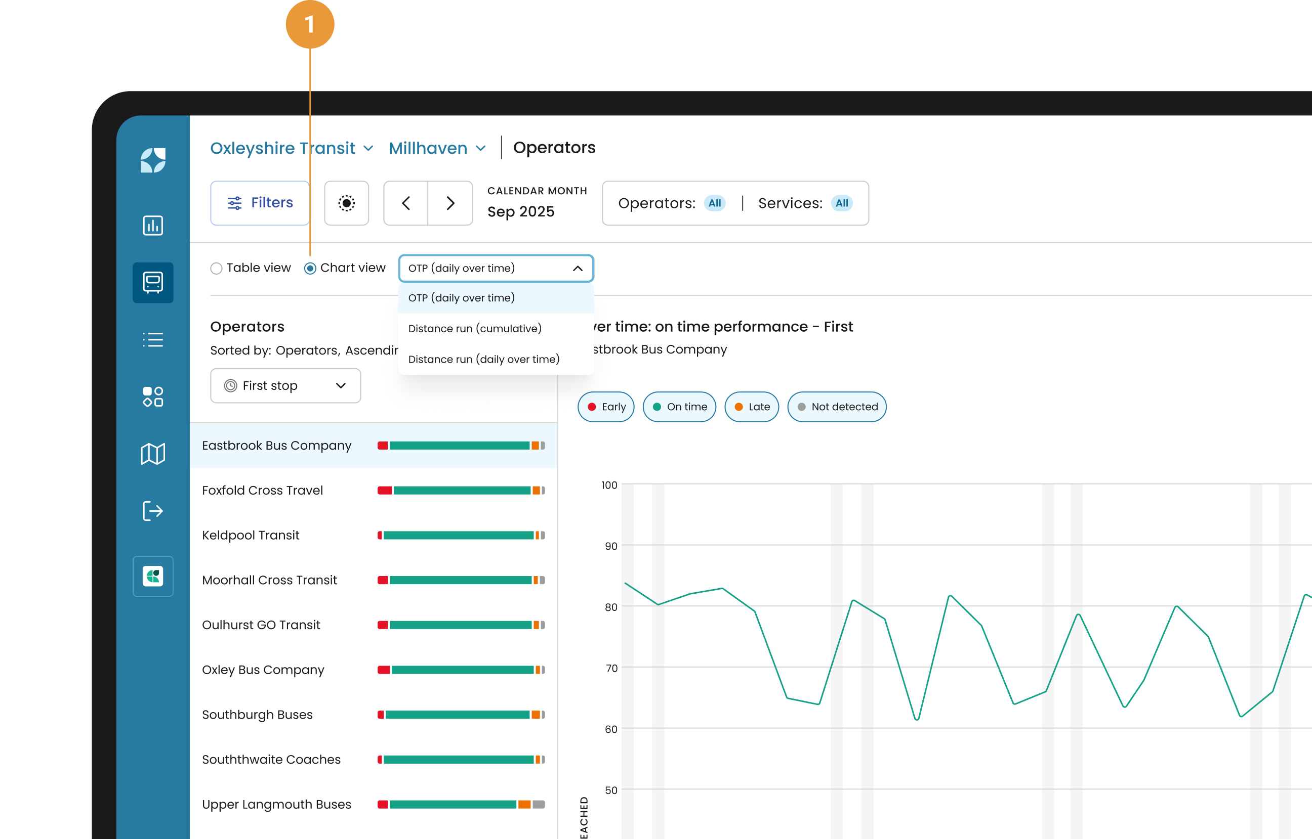
Chart view can be accessed through the “Chart view” toggle (1) at the top of either the Operators or Services list. After selecting “Chart view” you can select which chart you want to view via the dropdown. Chart options include: On-time Performance (daily over time), Distance run (Daily over time) and Distance run (Cumulative). The ordering is a reflection of the Table view.
When exclusions have been applied for a particular day/date(s) these will still be displayed in the horizontal axis but no data will be shown in the chart.
Chart types
-
On-time performance – daily over time
The On-Time Performance (OTP) Daily Over Time chart provides a visualisation of First stop, Timing Point and Last stop on-time performance for operators or services over a period of time (1). -
Distance run – daily over time
The Distance run (Daily Over Time) stacked chart shows total distance scheduled and total distance run each day, in both units and as a percentage of scheduled distance against your distance target (2). -
Distance run – cumulative
The Distance run (Cumulative) chart shows an accumulation of total distance scheduled and total distance run throughout the selected period, visualising the gap above or below the target over time (3).
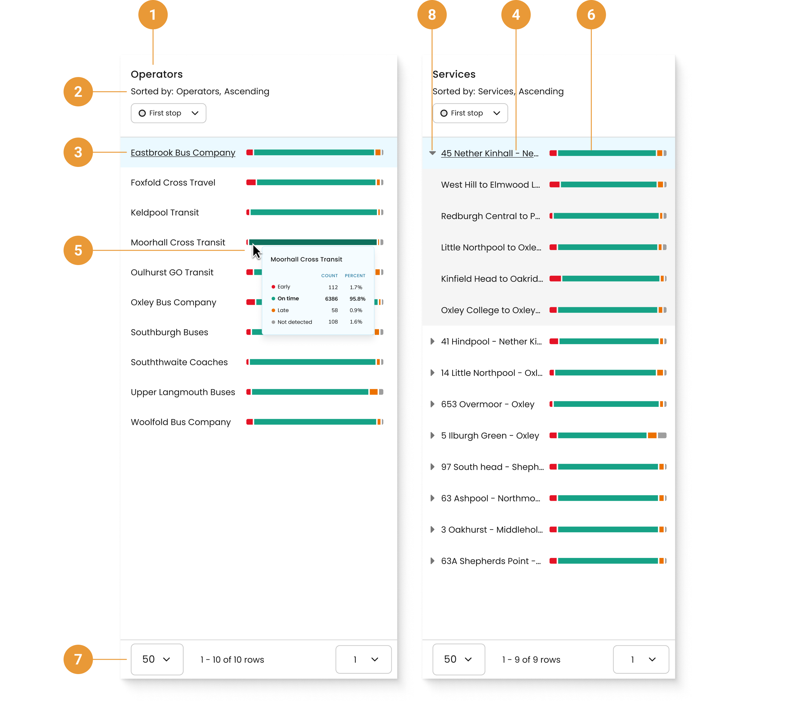
Side panel
Each chart type has a side panel relevant to the chart type. Each varies slightly, but all share some unique properties.
-
The title will be either Operators or Services (1).
-
The sorting of Operators or Services within the side panel is inherited from either the table view or KPI dashboard widget (2).
-
If you click the name of an operator in the side panel (3), you will be redirected to the Services page with all services related to that operator displayed. User the “Refine page” button to change the Services shown.
-
If you click on the name of a service in the side panel (4), you will be redirected to the Service details page with the chart view already selected.
-
Hovering over the bar chart will show a tooltip relevant to that chart type (5).
-
To see the chart view for a specific operator, service or variant, click on the bar chart in the side panel to show that operator's, service’s or variant’s data (6).
-
You can adjust how many operators and services are available in the side panel at the bottom of the page, as well as navigate between pages as required (7).
-
Click the chevron on a service row to expand and list that service’s variants (8).