
Service details is a deeper dive into the data within Services.
-
As indicated in the left hand navigation bar (1) you’re still on Services, but at a deeper level of data.
-
The breadcrumb at the top shows how the two data views are linked (2).
-
View a different service by:
-
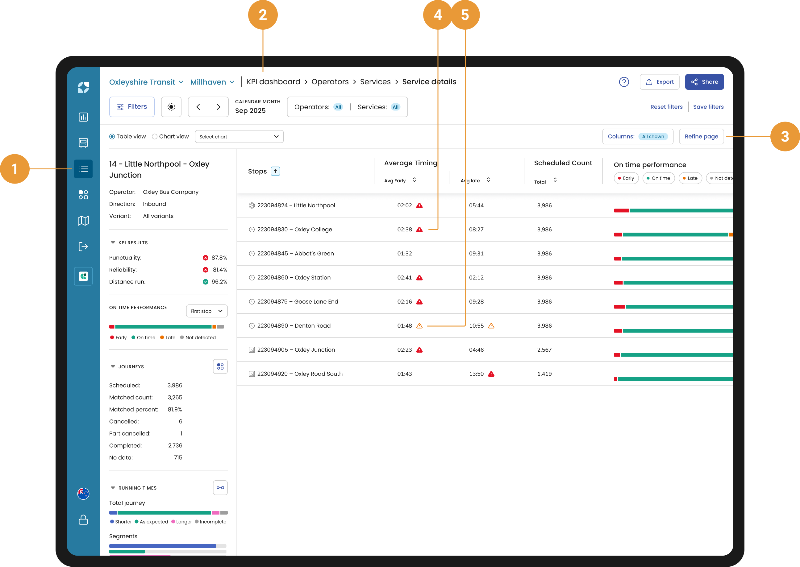
Two icons will appear to help highlight the average early or late time for a stop if the below conditions are met:
-
A red icon will appear if the average early or late threshold is above 200% (4)
-
An orange icon will appear if the average early or late threshold is above 175% (5)
-
Service details side panel - All Variants
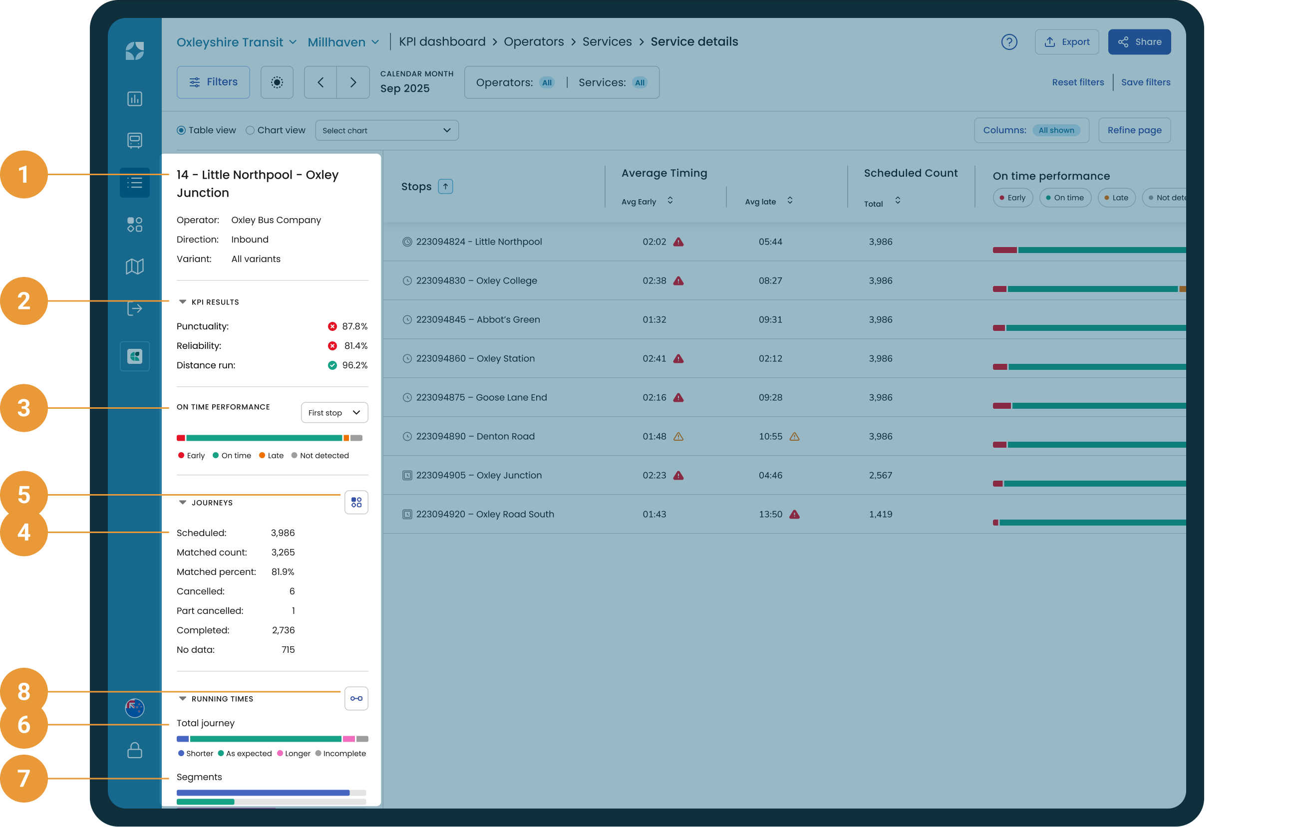
All the information in this left-hand section relates directly to the selected service as a whole, and reflects the data you clicked in Services:
-
Service name, variants, operator and direction (1)
-
KPI results (2)
-
On time performance - showing the aggregated on time performance for the selected stop type of this service, this screen will always default to the first stop (3)
-
Scheduled, matched count, matched percent, cancelled, part cancelled, no data (4)
-
View Journeys button - which takes you to the Journeys page (5)
-
The Running times - Total journey chart provides a summary of the performance of the total journey duration for completed journeys of the selected Service (6)
-
The Running times - Segments chart provides a summary of the performance across all segments within the selected Service (7)
-
View Running times button - which takes you to the Running times page (8)
As this data is at the service level, any filter changes we make in the table to the right will be reflected here.
Any date range selected on the Services will carry through to the Service details screen.
Inbound + outbound will add up to the total numbers for that service.
What am I looking at?
There are a few areas across the top of the screen to have a look at here:
-
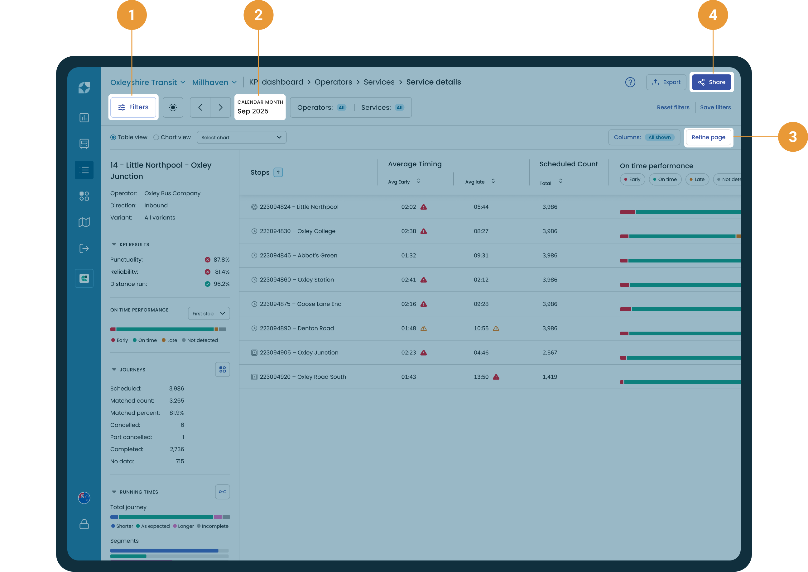
Use the filter hub to select the date range you’re interested in (1). The selected date will be shown in the filter panel (2).
-
Refine what is shown on the page by clicking the “Refine page” button which includes additional data filters for the stop-level information (3).
-
Share your view with other Insights users by clicking ”share” and copying the link (4).
Any date range selected on Services will carry through to the Service details screen.
Any selection of operators and/or services from within the filter hub will influence what operators / services are available to be selected from within the refine page panel.
About Service details
-
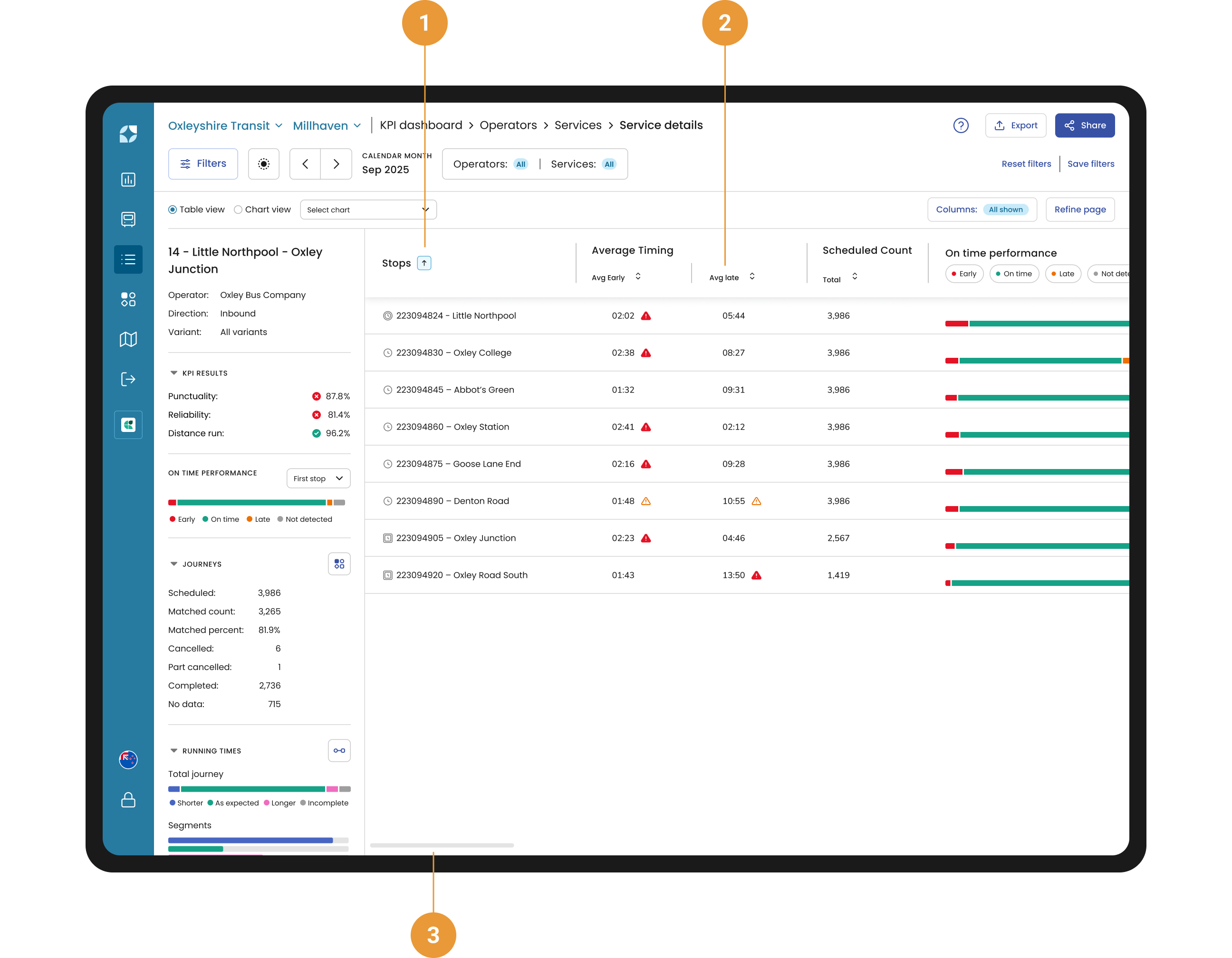
Click on a column header to filter the data by any of the columns (only available for all variants). When a filter has been applied, the selected column will have an arrow appear next to it which indicates which way the data is filtered – lowest to highest (arrow up) or highest to lowest (arrow down) (1).
-
Each column has a tool tip explaining the data being displayed. Hover over the column header to view the tooltip for more information about the data held in the column and how it’s calculated (2).
-
Use the horizontal scroll handle at the bottom of the page to access the full data table (3).
For every stop in the selected service, you can view:
-
Average timing - the average time a matching bus heartbeat was detected as either early or late at this stop
-
Scheduled count - the number of times a vehicle was scheduled to visit this stop
-
On time performance - the count and percentage of matched journeys where the closest heartbeat at the stop is compared to the scheduled time as either early, on time, late or not detected. Please refer to the FAQs for more information on on-time performance and EOL.
-
Running time - Segments - the count and percentage of matched journeys where the actual running time for the segment into this stop (from the previous stop) is either shorter, as expected, or longer than the scheduled running time.
-
Stop counts are calculated from the schedule data and include:
-
First stop count - the number of times the closest matching bus heartbeat was detected at this stop as the first stop on its trip, out of the total number of scheduled visits
-
Last stop count - the number of times the closest matching bus heartbeat was detected at this stop as the last stop on its trip, out of the total number of scheduled visits
-
Timing points count - the number of times this stop was counted as a timing point for a bus passing it, out of the total number of scheduled visits
-
Data in the Punctuality On time performance chart before 4th September 2023 will be missing or look unusual as the chart first started gathering data on 4th of September 2023
Chart View
The chart view in Service details gives you a view of your key metrics over time. Each service variant is listed on the left, and the main chart plots daily trends so you can quickly spot patterns and performance changes over time.
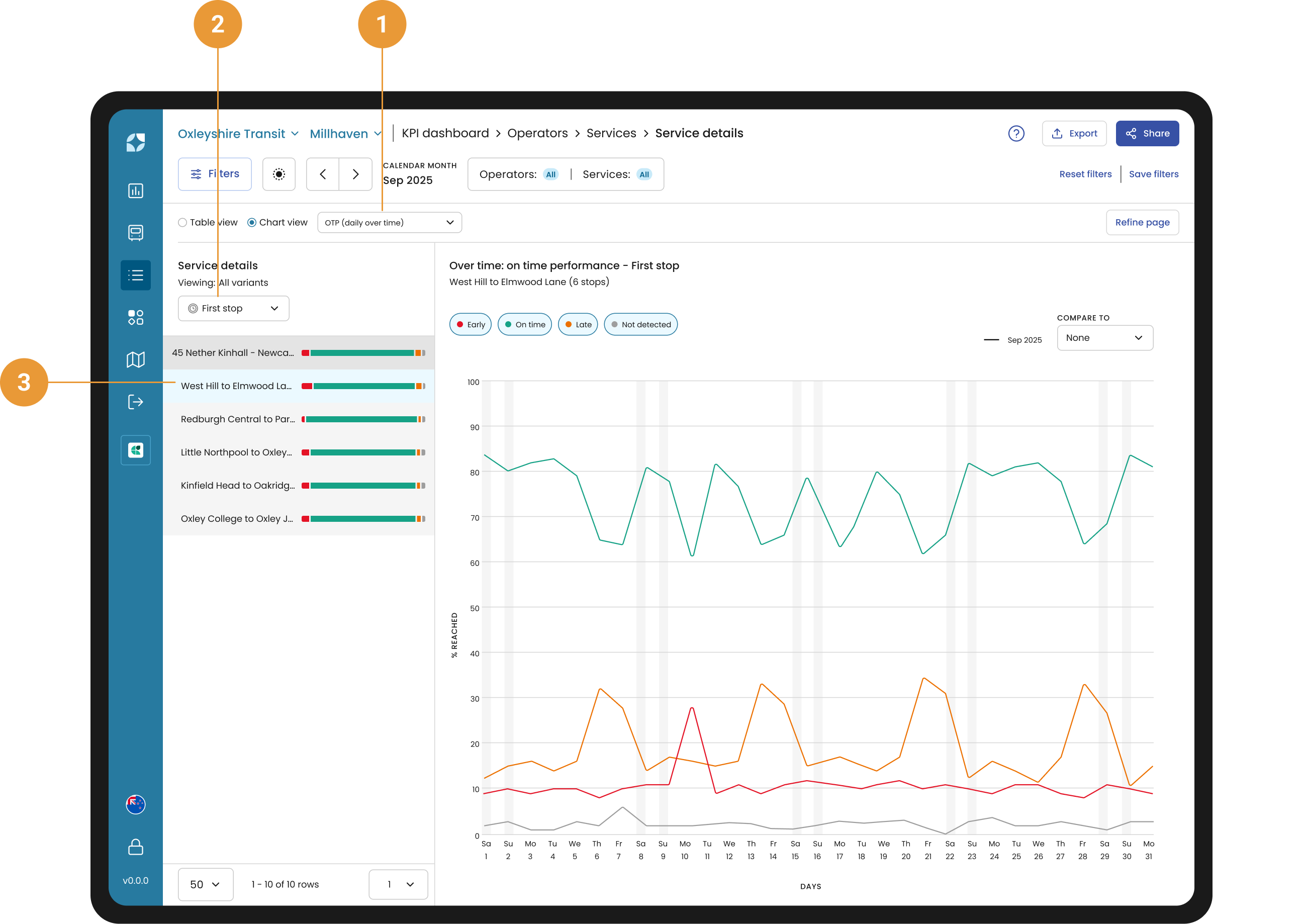
-
Switch between available chart metrics using this dropdown - On-time performance (OTP), Distance run (daily over time) or Distance run (cumulative) (1)
-
View the First stop, Last stop, or Interim timing points (2)
-
Data for the selected variant appears in the visualisation (3)