
Reliability KPI performance daily over time (Archived)
This chart gives a view of data for the five highest- or lowest-performing operators for the date/operator range selected.
The performance data is shown by day.
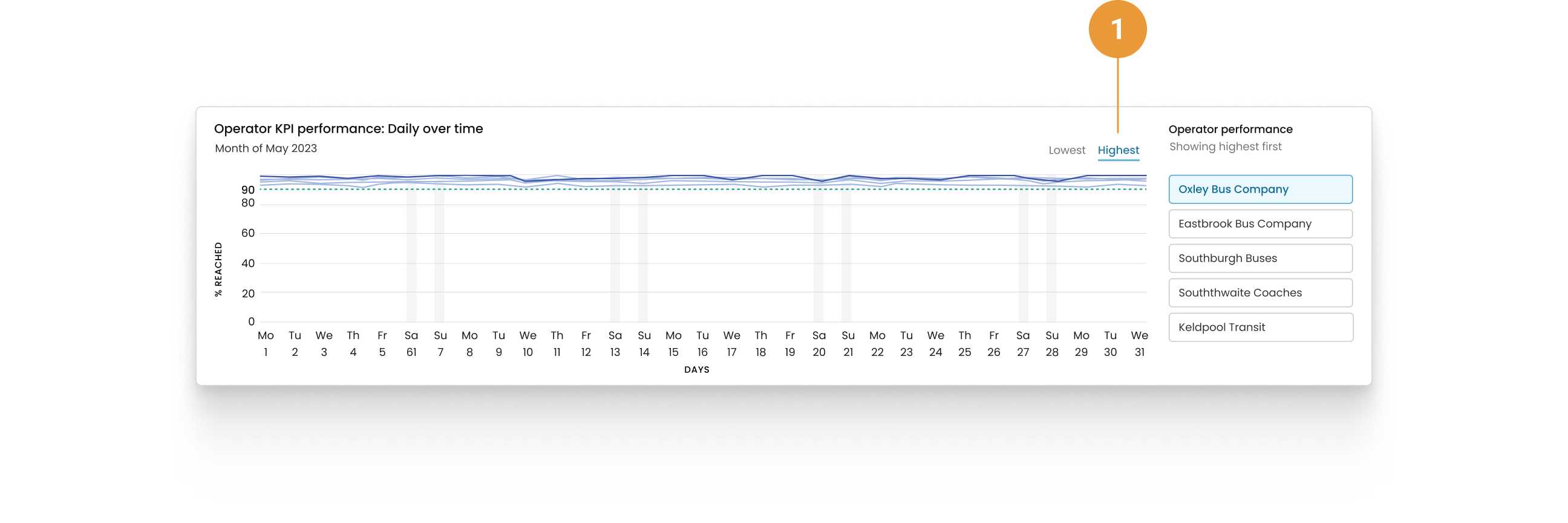
By default, highest (1) will always be selected.
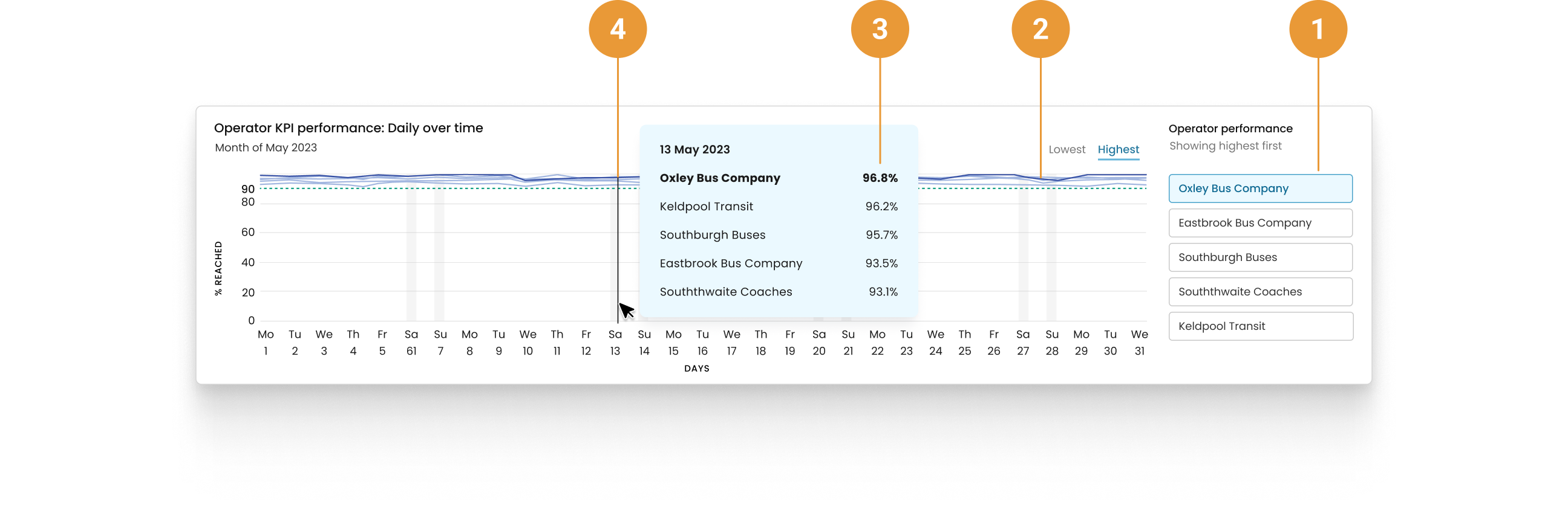
The operator selected to the right of the container (1) has its data line highlighted in the line graph shown to the left (2). Hovering over the line graph data reveals detail specific to the day (3), i.e. the operators included and their respective percentages, plus the date (4).
Remember that, as with all the charts, the date range selected for the overall view will also be reflected here.
When exclusions have been applied for a particular day/date(s), these will still be displayed in the horizontal axis but no data will be shown in the chart.
EXAMPLE #1
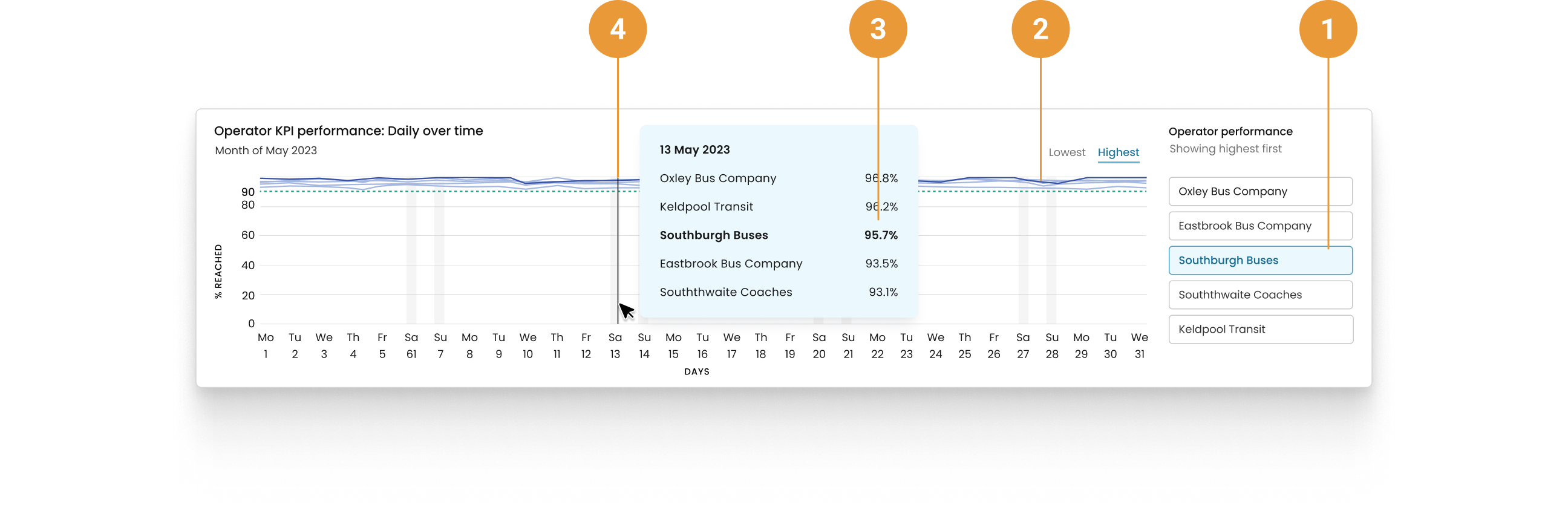
Southburgh Buses’ data is highlighted in the line graph (2) as they are selected to the right of the container (1).
Hovering over data for 13 May (4), we can see the breakdown of percentages for the five lowest performing operators, with Southburgh Buses highlighted again in this view (3) as they’re selected to the right.
EXAMPLE #2
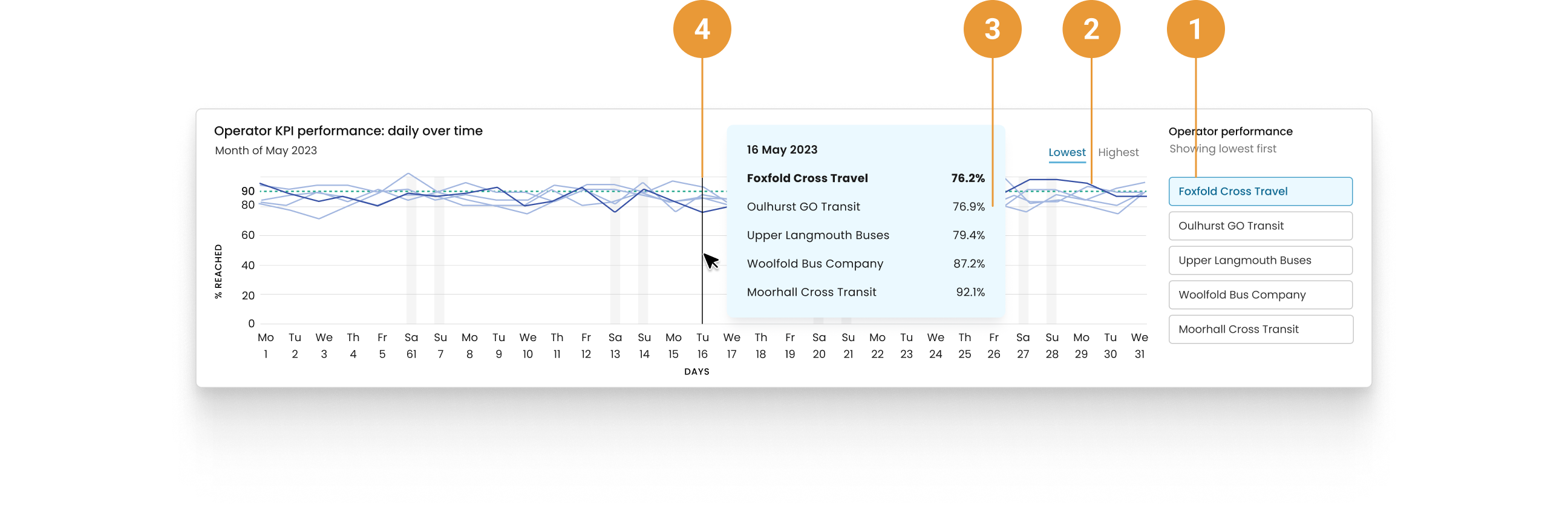
Foxfold Cross Travel’s data is highlighted in the line graph (2) as they are selected to the right of the container (1).
Hovering over data for 16 May (4), we can see the breakdown of percentages for the five lowest performing operators, with Foxfold Cross Travel highlighted again in this view as they’re selected to the right.