
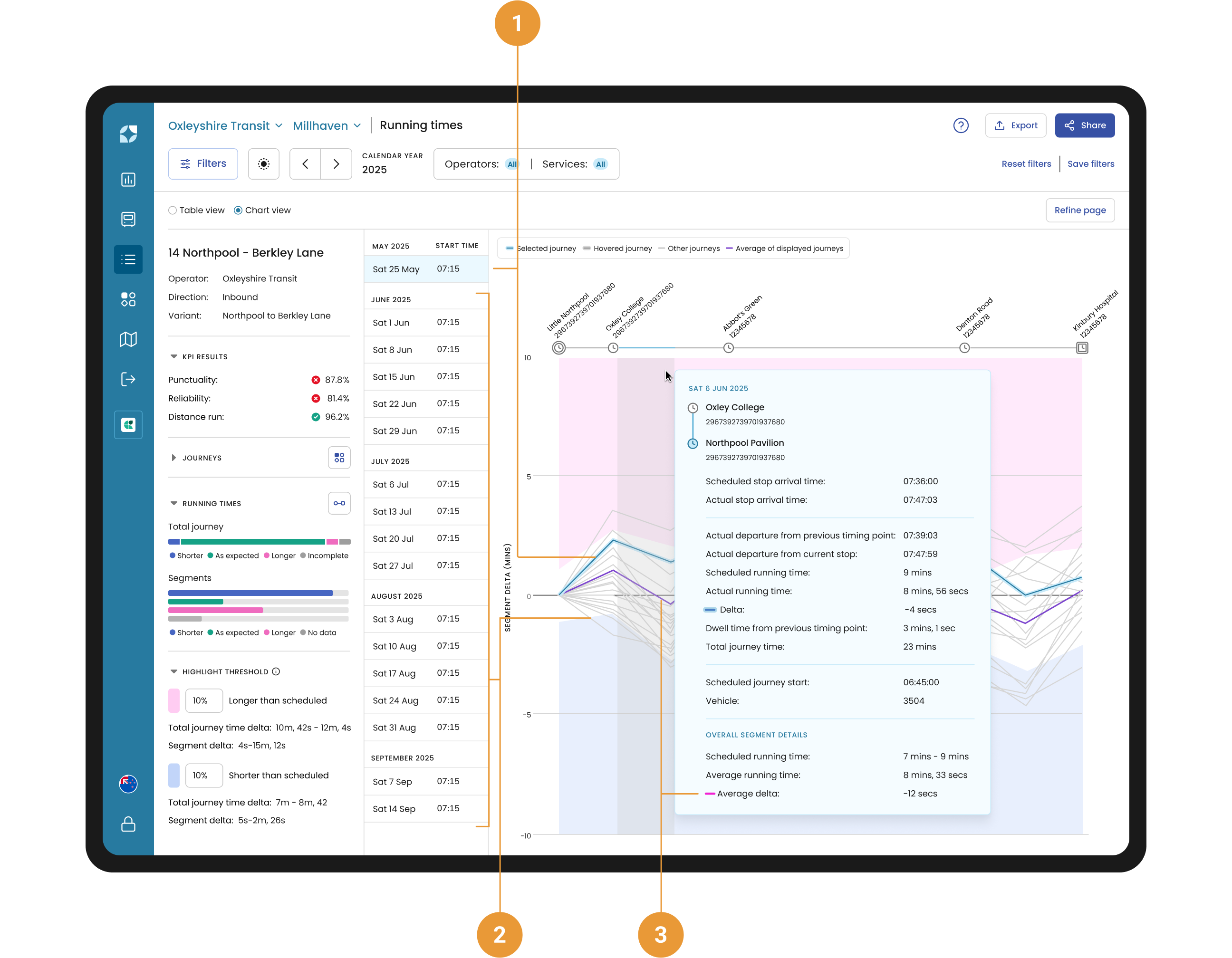
Running times Chart view allows the user to visually inspect the performance of a selected trip, compared to the average for all trips. In particular,
-
The selected trip is highlighted in light blue in the list of filtered trips alongside the chart and appears as a dark blue line within the chart (1),
-
Filtered trips that are unselected trips appear as light blue lines in the chart (2), and
-
The average of all trips included in the filter appears as a pink linen the chart (3).
Highlight thresholds | Chart view are applied to the background of the chart so that a user can see whether their selected trip (or the average for all trips) is running shorter or longer than the scheduled duration.
Selected trip tooltip
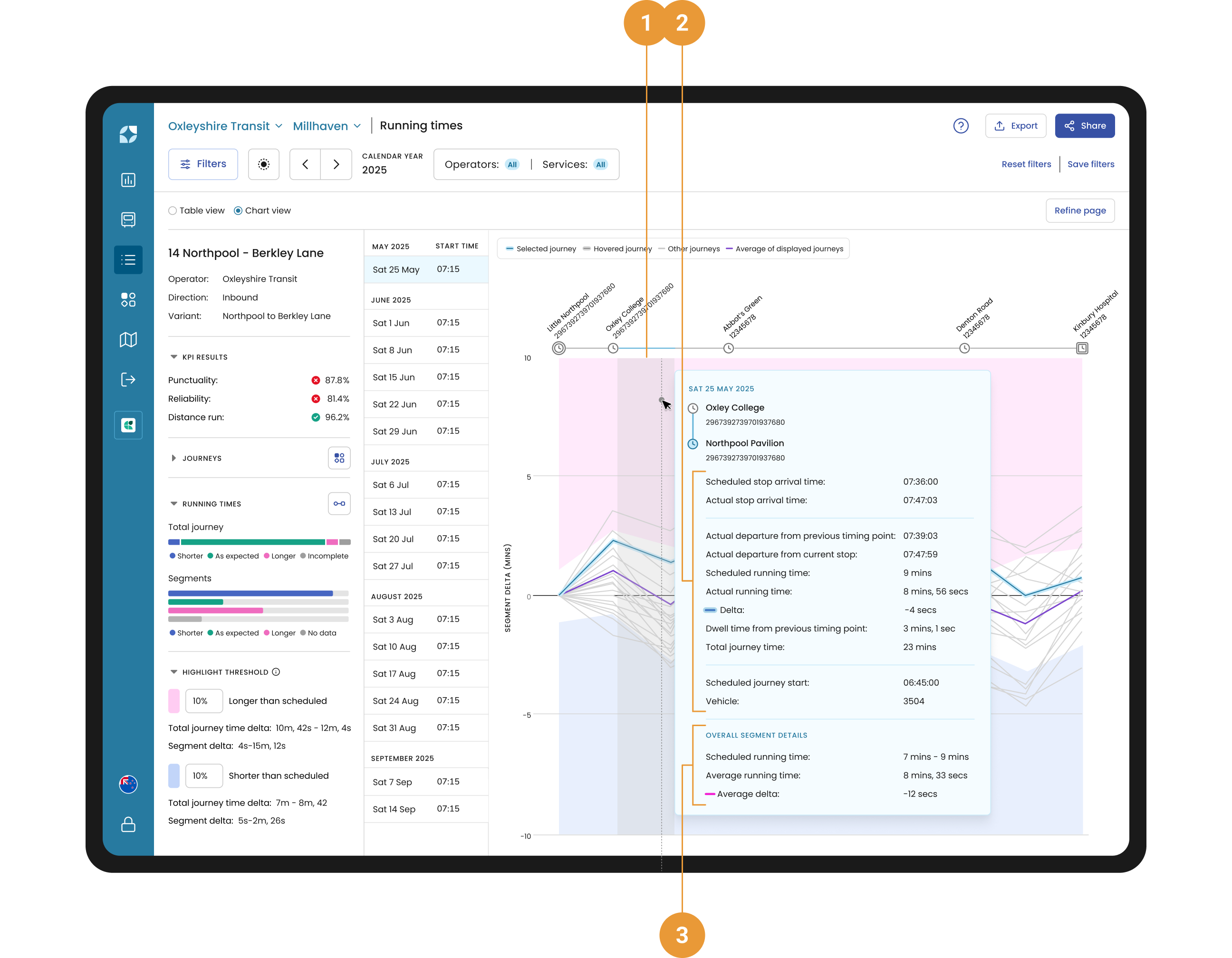
Hovering over the chart will show a tooltip with additional information.
The grey highlight shows what segment of the journey the data is referring to (1).
The content within the tooltip includes the same information relating to the highlighted segment as the Table view (2), and some additional information relating to the average performance of the highlighted segment. Overall segment details for all trips includes (3):
-
Scheduled running time - Within this section, the scheduled running time refers to the range of scheduled running times that apply for the filtered trips for this segment.
-
Average running time - The average time range between the departure from one stop and the departure from the next stop, including dwell at the stop for all trips.
-
Average delta - The average difference between the Scheduled running time and Actual running time for all trips. This is also shown in the chart as a pink line to allow the user to compare their selected trip with the average performance of all trips.