
The data quality indicator displays the volume of actual journey level real-time data (we support GTFS and Real time vehicle location data) that has been received and compared against the schedule data (GTFS Schedule dataset).
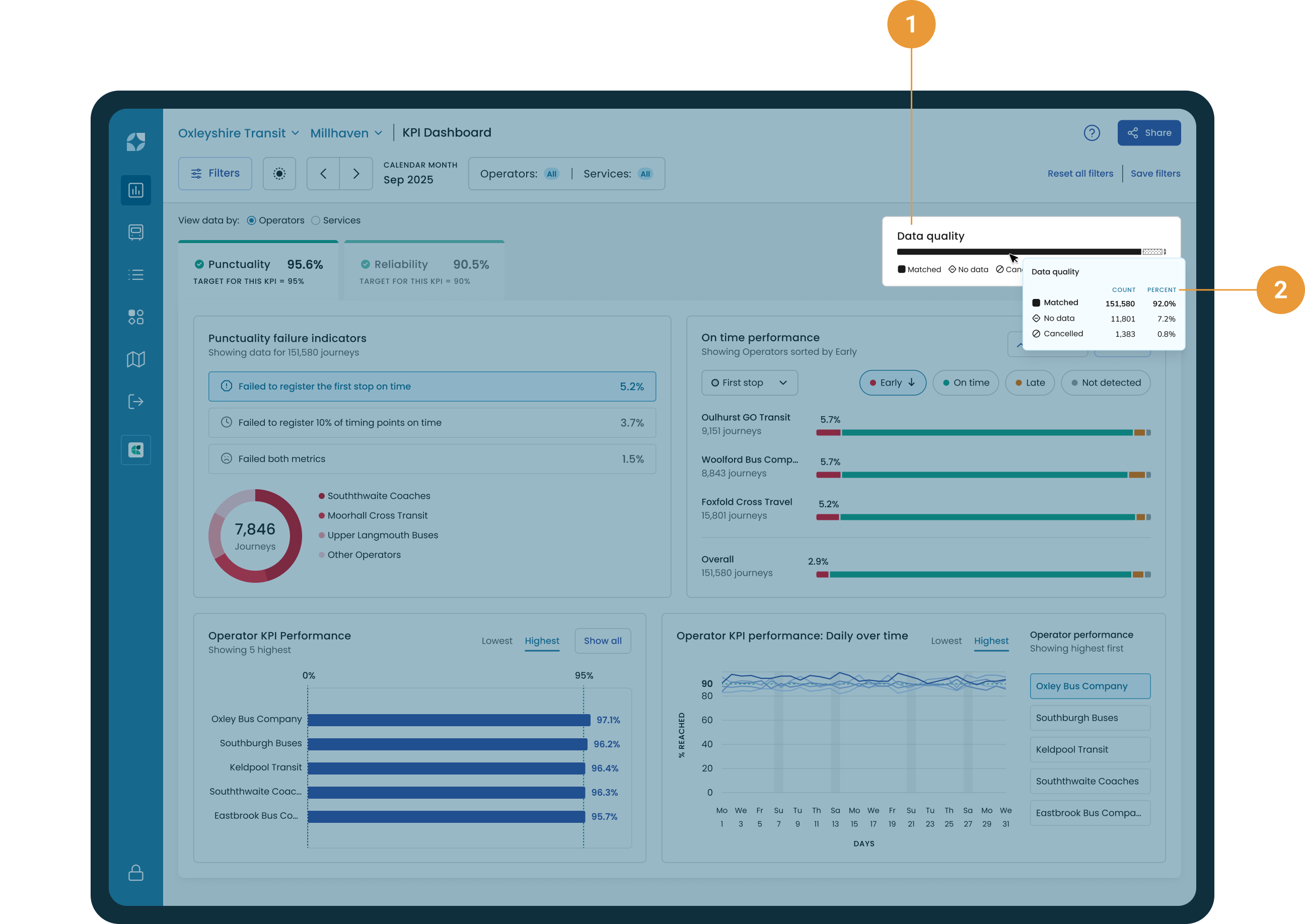
The data quality indicator is found in the top right of the KPI Dashboard (1). The view provides the following information regarding journey level data:
-
Matched - Indicates either the percentage or count of journeys that were matched.
-
No data - Indicates either the percentage or count of journeys where no data was received.
-
Cancelled - Indicates either the percentage or count of journeys that were cancelled.
The view changes to reflect whether all operators or one operator is selected. The tooltip displays data quality by percentage and count (2).
Real-time heartbeats received without a trip_ID are classed as dead running and don’t register in this data.
Example 1
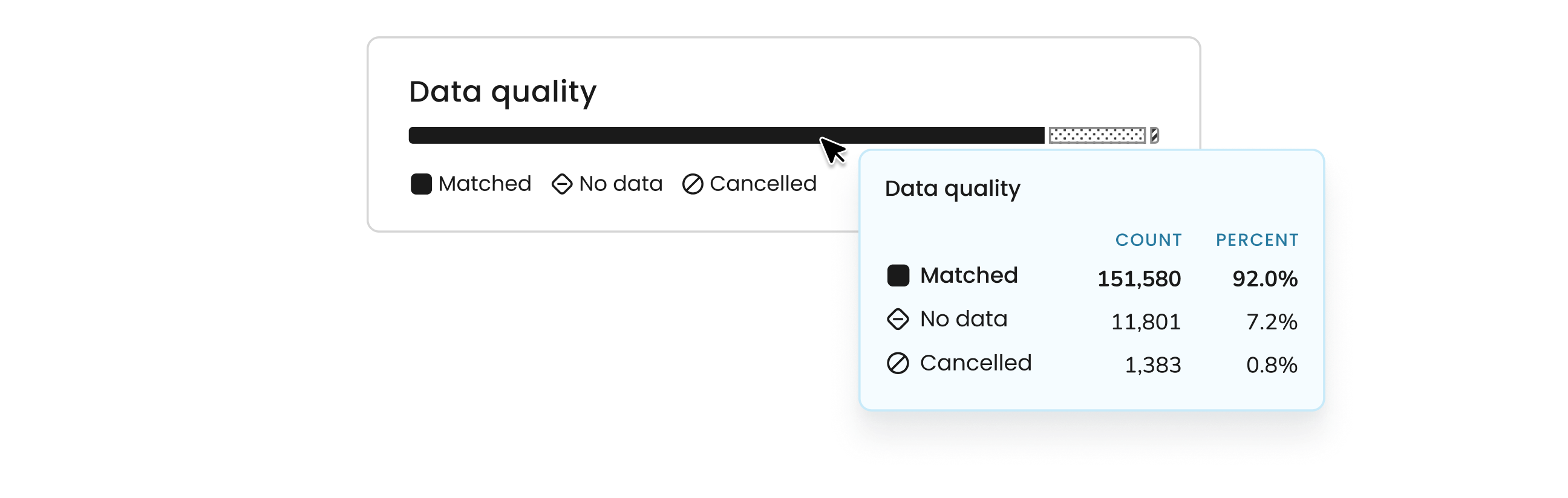
By toggling between the percent and count figures, we can see that over 151,580 journeys have been matched from the real-time data to the schedule data, which equates to 92% data accuracy.