
Punctuality KPI performance: Highest/lowest
The KPI performance highest/lowest chart shows the top five highest- and top five lowest-performing operators or services in terms of punctuality.
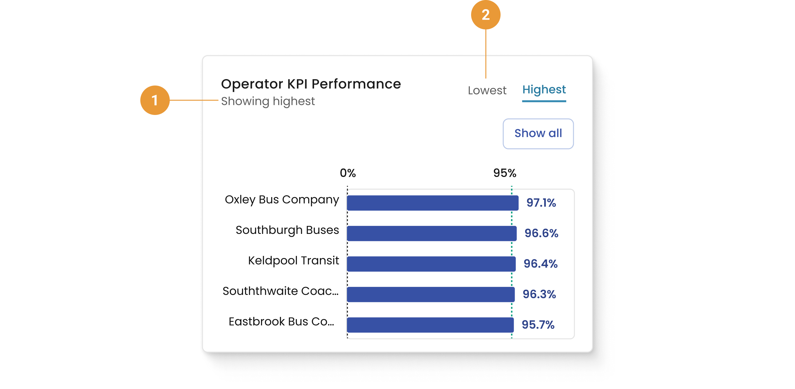
The KPI performance chart defaults to highlighting the five highest-performing (1) operators for the selected date/operator range. To view the five lowest-performing (2) operators for the selected date/operator range selected, click “lowest” to the right of the box.
The “Show all” button takes you to the appropriate Operators or Services page.
Punctuality KPI performance: Daily over time
The KPI performance: daily over time chart shows daily punctuality data for the five highest- or lowest-performing operators or services over a selected period of time.
The performance data is shown by day.
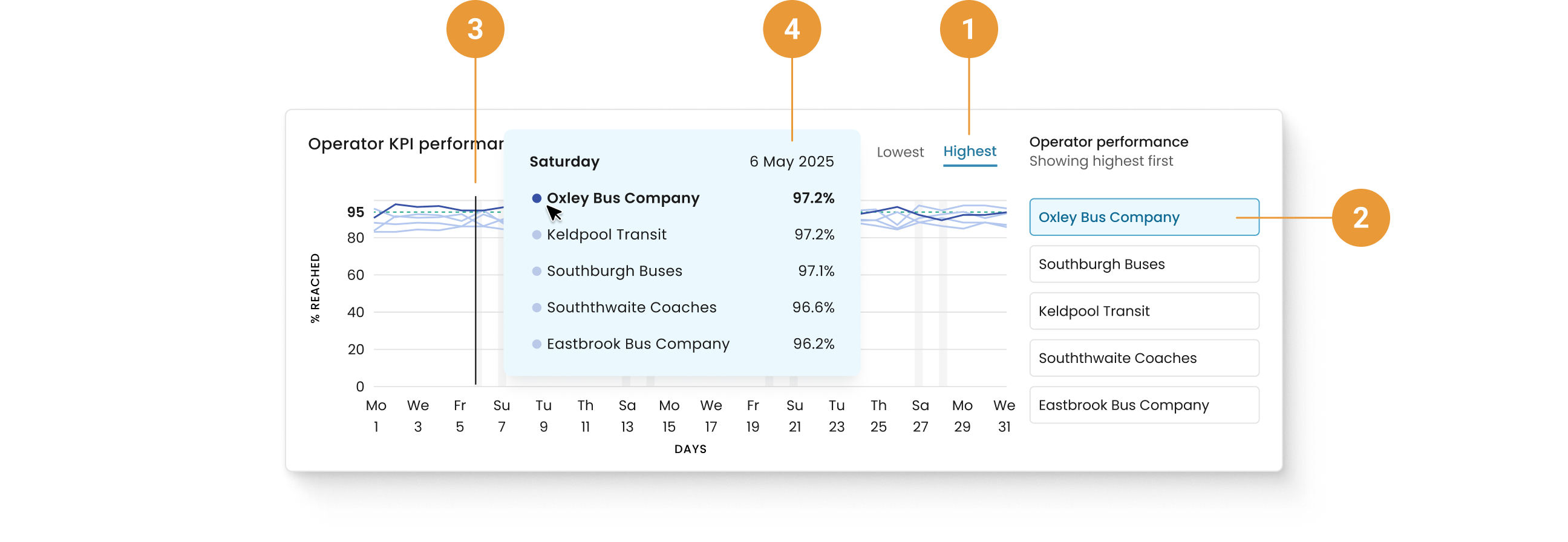
Toggle to select either the five highest- or lowest-performing (1) operators for the date/operator range.
The operator selected to the right of the container (2) has its data line highlighted in the line graph on the left (3).
Hovering over the line graph reveals details specific to that day (4), including the operators selected and their respective percentages, plus the date.
As with all charts, the date range selected for the overall view is also reflected here.
When exclusions have been applied for particular date(s) those will appear in the horizontal axis, but no data is shown in the chart.