
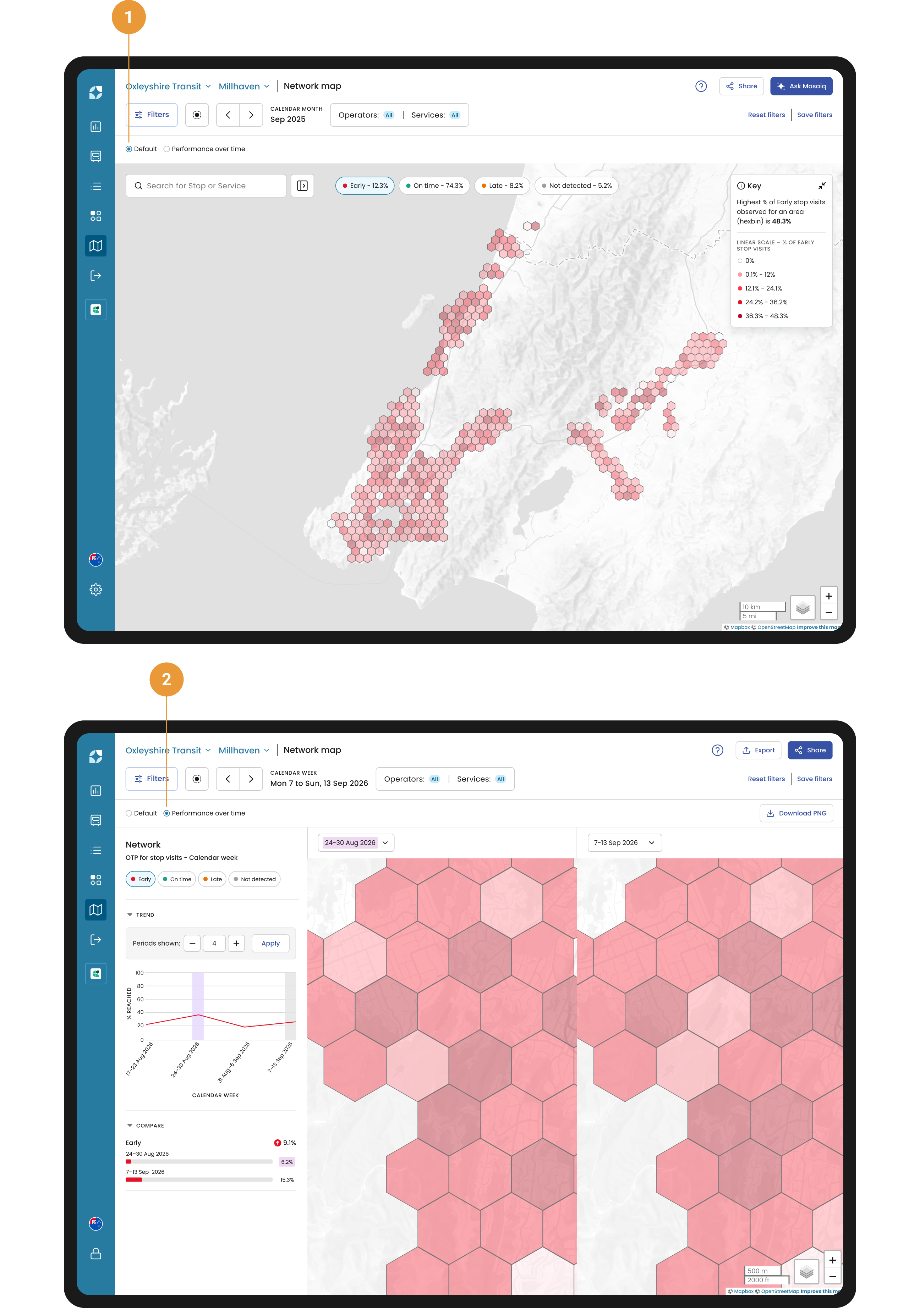
The Network Map is designed to give you a complete, interactive view of your entire transit network at your fingertips. The Default view (1) displays on-time performance (OTP) for a single period in time across your network, so you can spot problem areas at a glance rather than checking one stop or route at a time. It is the starting point for finding where performance issues sit before you switch to the Performance over time view (2), or drill into an individual stop or route.
The Network map makes it faster and easier to find improvement opportunities for stops and services. Switch between terrain and satellite views for a more dynamic mapping experience, and search smarter by entering just part of a stop or service name or ID.
Want to track performance? You can view stop performance over any period you choose, allowing you to spot trends, identify areas for improvement, and take action where needed.
Accessing the Network map
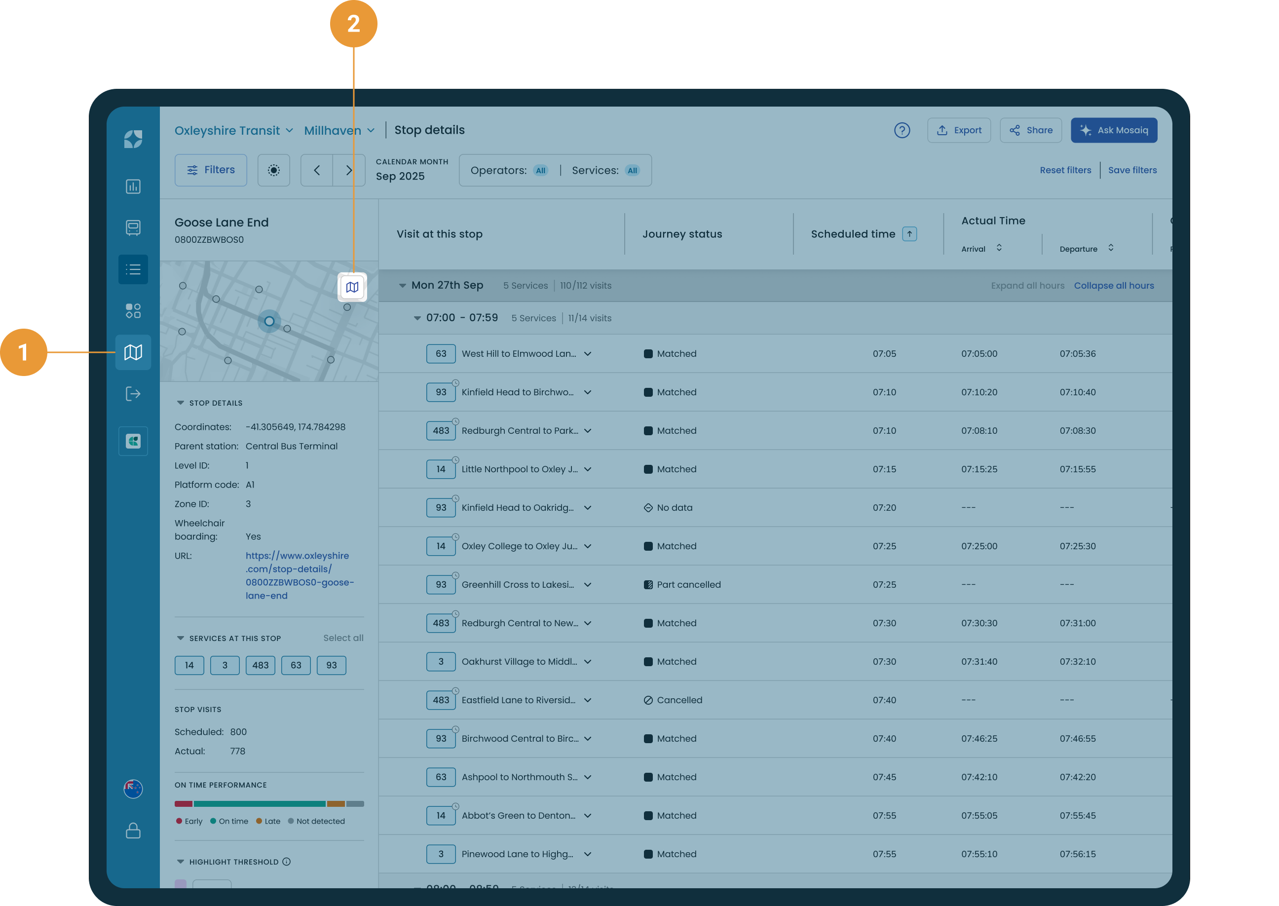
You can find the Network map in the main navigation bar (1). If you're analysing a particular stop on the Stop details page, click the map icon 
Filter and configure the map
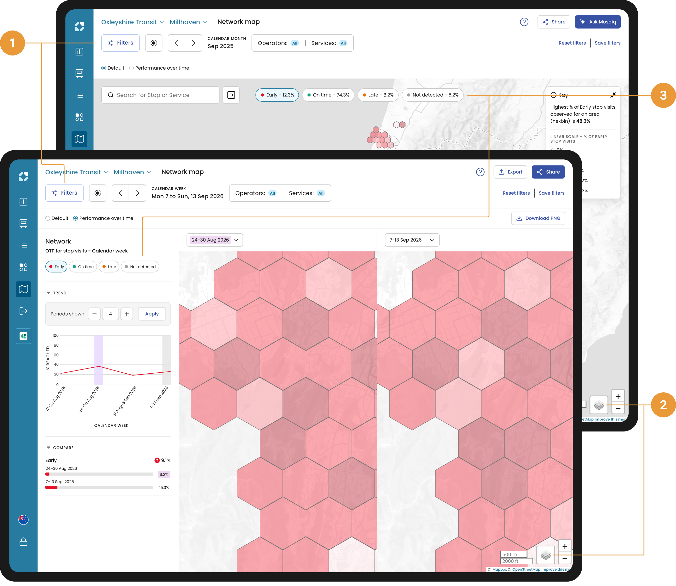
The filter panel and hub (1) provide filtering and configuration options to tailor what you see on the map:
-
Date range. Adjust the timeframe for which on-time performance data is displayed. This affects tooltips, the side panel, and map rendering.
-
Operator and Service filters. Narrow down what is shown on the map by selecting specific operators or services. This helps reduce visual clutter and allows you to focus your analysis.
-
Clear Filters. Reset the map to its default state by clearing any active filters.
The Network map consists of a base layer and overlaid data that provides insight into the performance of stops and routes in your network.
-
Base layer. You can enable one base layer at a time to define the overall appearance of your map (2).
-
Standard view. This is the default basemap, offering a clear and simple view of your network.
-
Satellite view. This is the satellite basemap that provides a realistic, high-detail perspective of the area.
-
-
On-time performance layer. This is enabled by default when you arrive on the Network map. By default, Early OTP is selected. Toggle these Early, On-time, Late, Not Detected (EOL)* chips on or off to quickly identify where the problems in the network are (such as early, late, not detected) so you can start a deeper investigation (3).
-
Stops layer. This is displayed when a user has deselected all EOL chips at the top of the page.
*Please refer to the FAQs for more information on how EOL is defined.
On-time performance layer
The on-time performance (OTP) overlay helps you see the signal in the noise, compare areas, and make smarter decisions. A hexbin map, also known as a hexagonal bin map, divides a spatial area into hexagons and uses colour to represent data aggregated within each hexagon.
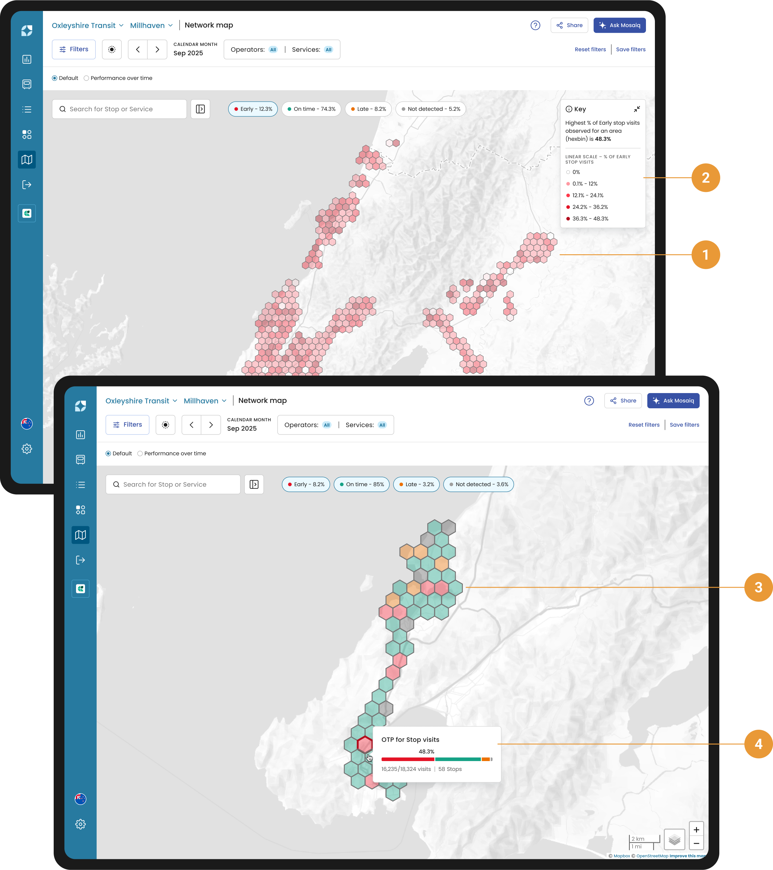
OTP appears as hexbins on the map, coloured by their corresponding category (Red = Early; Green = On time; Orange = Late; Grey = Not detected). Each hexbin contains a number of stops, and their performance determines the hexbin colour. Selecting a single EOL chip or multiple chips changes how hexbins are coloured:
-
When a single EOL chip is selected, the map shows shades of a single colour from lighter shades for lower values to darker shades for higher values(1). The key describes what each colour shade represents (2).
-
When multiple EOL chips are selected, the map shows solid colours, each corresponding to a selected category (3). The colour of each hexbin represents the predominant EOL category of the stops inside the hexbin.
Hover over a hexbin to view a summary of performance for stops in that hexbin (4), including:
-
Number of stops inside the hexbin.
-
Number of actual visits compared to the scheduled visits to the stops.
-
OTP bar showing the aggregation of all the stops' on-time performance percentages.
Stops layer
The Stops layer lets you quickly identify and explore all stop locations in your network.
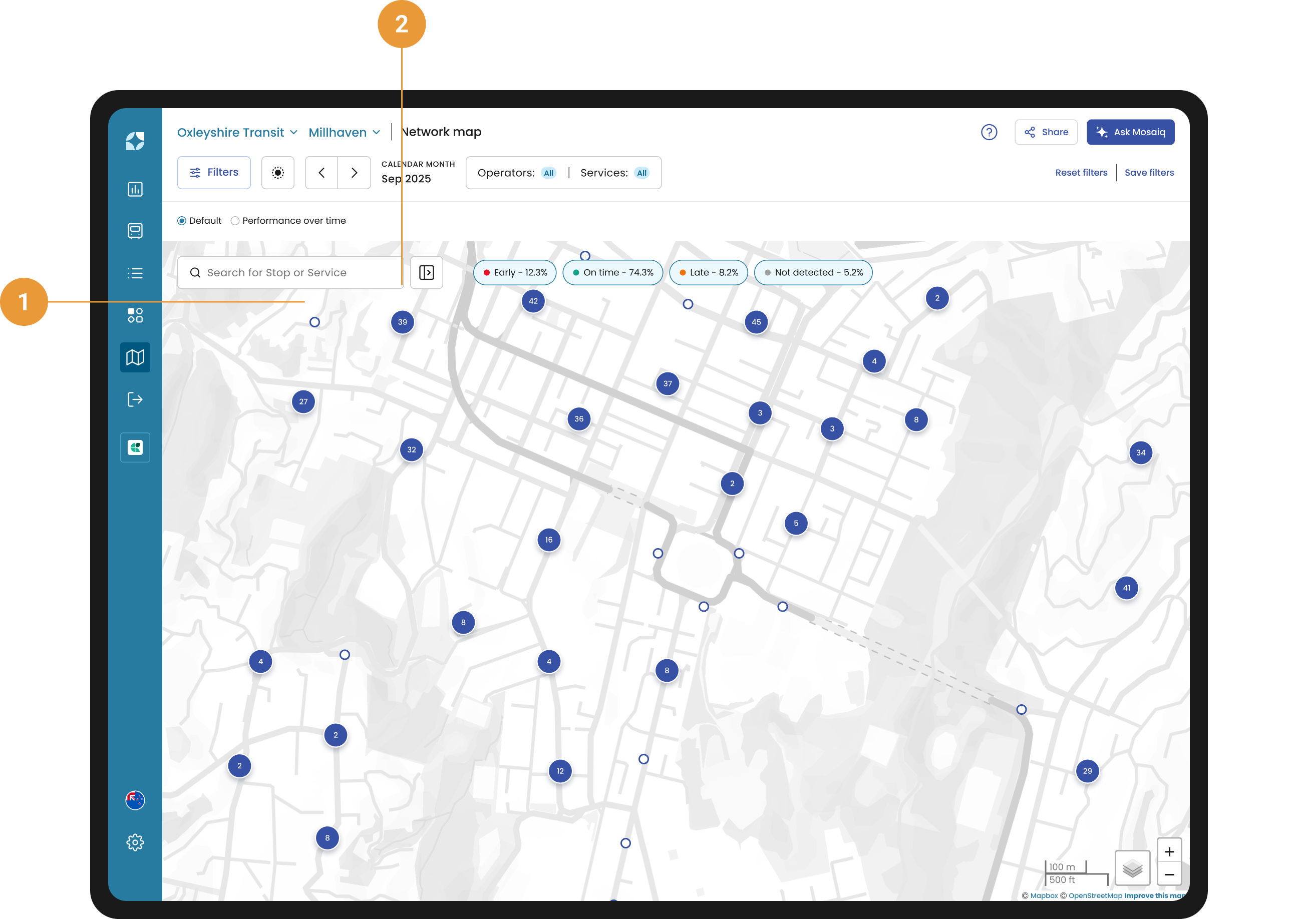
Stops appear as blue circles on the map (1), making them easy to identify.
When zoomed out, stops are grouped into clusters (2), with the number of stops displayed on each one. Click a cluster to zoom in and reveal smaller clusters or individual stops. Continue clicking until individual stops are fully visible on the map.
As you zoom in, clusters break apart, and individual stop locations become visible.