
Data quality is a core pillar of Mosaiq Insights. We are committed to providing customers with the most accurate and trusted insights. To ensure that users can rely upon what their data tells them within Mosaiq, data quality measures are available throughout the product.
Why data quality matters
High quality data enables users to:
-
Understand how reliable their insights are
-
Investigate what factors might be contributing to the data quality
-
Investigate which operators/services are most impacted
The higher the data quality, the higher the confidence in the insights provided by Mosaiq.
Transparent reporting helps uncover issues, making it possible to address and improve data quality over time.
Many factors contribute to data quality, therefore Mosaiq provides many avenues to better understand data quality so that, where possible, the insights can be improved over time. This could be:
-
Enhancing our stop matching process
-
Engaging with your data provider to ensure the data is accurate and complete
-
Ensuring drivers are tripping on/off the right trips at the right time
Accessing data quality
Data quality gives you confidence in the insights you are seeing. Therefore, in Mosaiq Insights data quality measures are always available alongside any metrics you are accessing. In particular, data quality is communicated in the following ways:
-
A data quality bar chart available on the KPI dashboard and Journeys screens.
-
Within on-time performance and running times bar charts
-
Within on-time performance over time chart
-
As shading within hexbins or journeys squares
-
As separate columns, such as the operators and services lists
-
Within tooltips and side panels
Data quality types
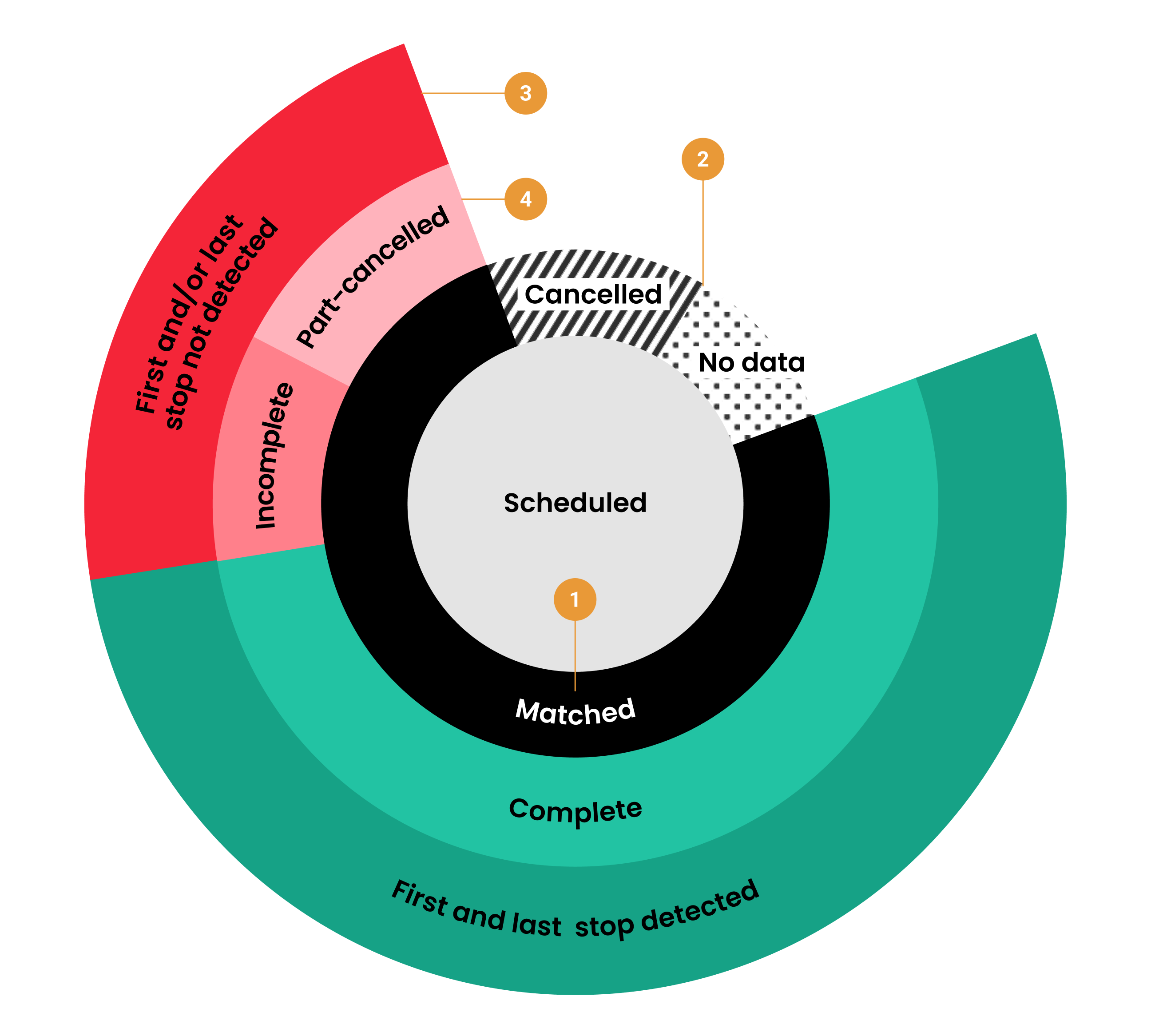
Mosaiq Insights processes your current schedule (e.g. GTFS) and your vehicle location, or stop visit, transit data (could be real-time or a flat file). The highest level of granularity, or an overall measure of data quality is the percentage of scheduled trips that are matched to actual trips (1).
Matched trips are those where at least one vehicle heartbeat has been observed and associated with the corresponding scheduled trip.Scheduled trips that are not matched are classified as either cancelled or no data (2).
Not matched could indicate that either no heartbeats for a vehicle were observed for a scheduled trip or an observed trip was not scheduled.When a scheduled journey is fully removed from operation and does not run at all it is referred to as cancelled. Please refer to the FAQs for more detail on how cancellations are calculated.No data could indicate either missing information, that a service is not available or an error in data collection. For more information click here.Note that full cancelled trips are not counted as matched trips but part-cancelled trips do count as matched trips.
At a more granular level, users can better understand the data quality of matched trips by diving deeper into the product. For each matched trip, our stop matching process assigns heartbeats to stops along the route. In some cases, this process may result in stops that are not detected (3). Not detected first and/or last stops can result in incomplete journeys and not detected interim stops can result in incomplete segments (4).
Not detected refers to when a vehicle was not “seen” or observed at a timing point or stop.Incomplete journeys are those where the first and/or last stop of a journey has not been observed or detected.Segment is defined as a portion of a trip for running time assessment and could represent either a stop to stop, a timing point to timing point, or from a previous timing point to the current stop.Visualising data quality
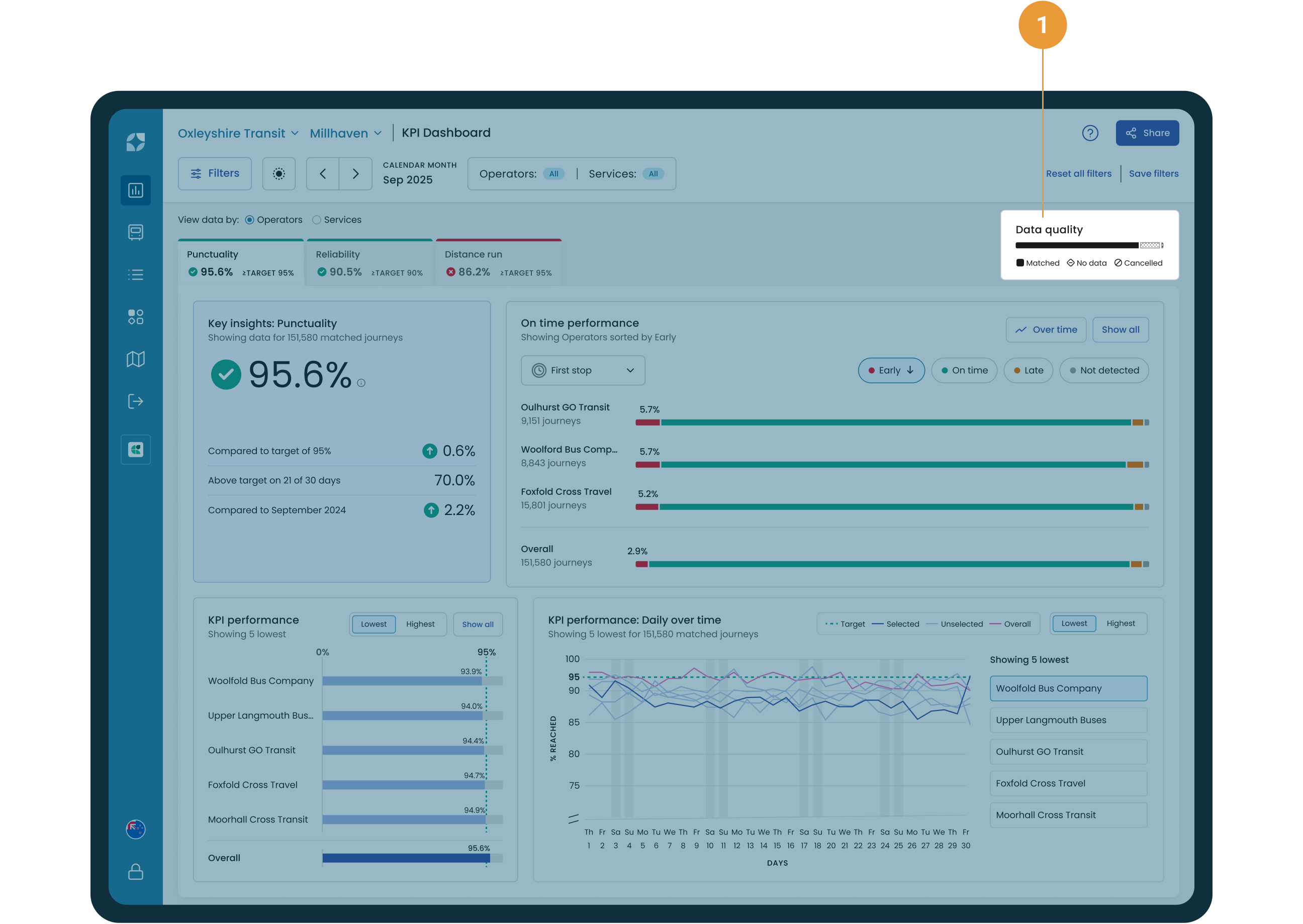
The overall measure of data quality is available within the data quality bar chart which is shown on the KPI dashboard screen (1). The data quality bar chart displays the volume of actual journey level real-time data (we support GTFS and Real time vehicle location data) that has been received and compared against the schedule data (GTFS Schedule dataset). In particular, the data quality bar chart provides both the count and percentage of scheduled trips:
-
That matched to actual data
-
Where no data was received
-
That were cancelled
A tooltip is available which displays a journey percentage and count, and changes to reflect whether all operators or one operator is selected (see Example #1).
Real-time heartbeats received without a trip_ID are classed as dead running and don’t register in this data.
The Journeys screen also provides a view of data quality for each scheduled journey, where each journey is represented by a single icon. When the journey has:
-
Been matched to a schedule but the selected stop has not been detected

-
Not been matched to a schedule

-
Been cancelled

Users can dive deeper and view data quality of matched trips at an operator, services and variant level to identify where improvements to data quality can be made (see Example #2).
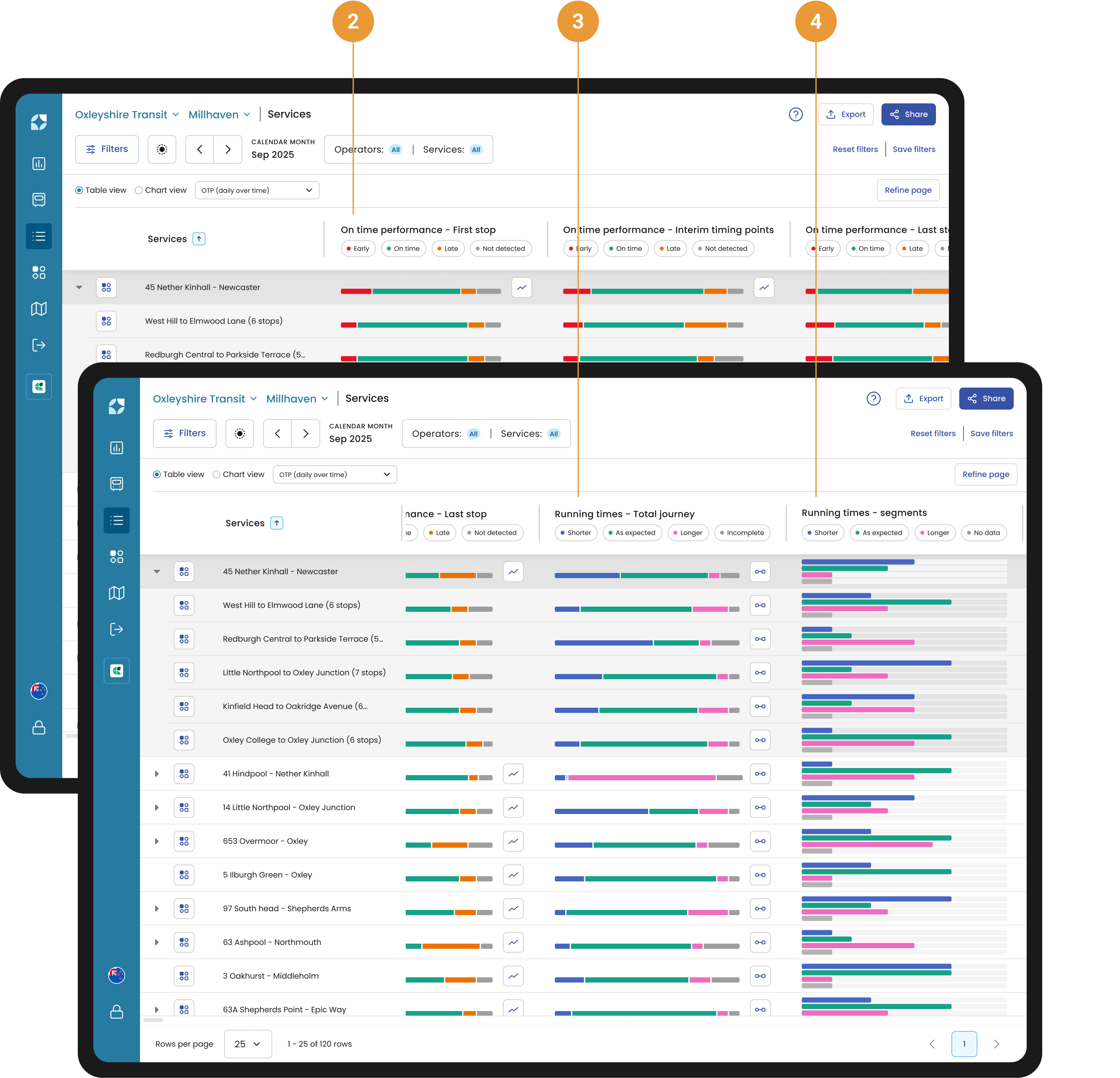
The data quality at first stop, timing point and last stop is visualised in all on time performance charts (bar charts and over time charts) (2). These charts provide the count and percentage of first stop, timing point and last stops that were not detected.
When there are first and/or last stops that are not detected for any of the selected trips an incomplete bar will be shown in Running times - Total Journey bar chart (3). When stops either side of a segment are not detected for any segments within the selected trips then an incomplete bar will be shown in Running times - Segment bar chart (4).
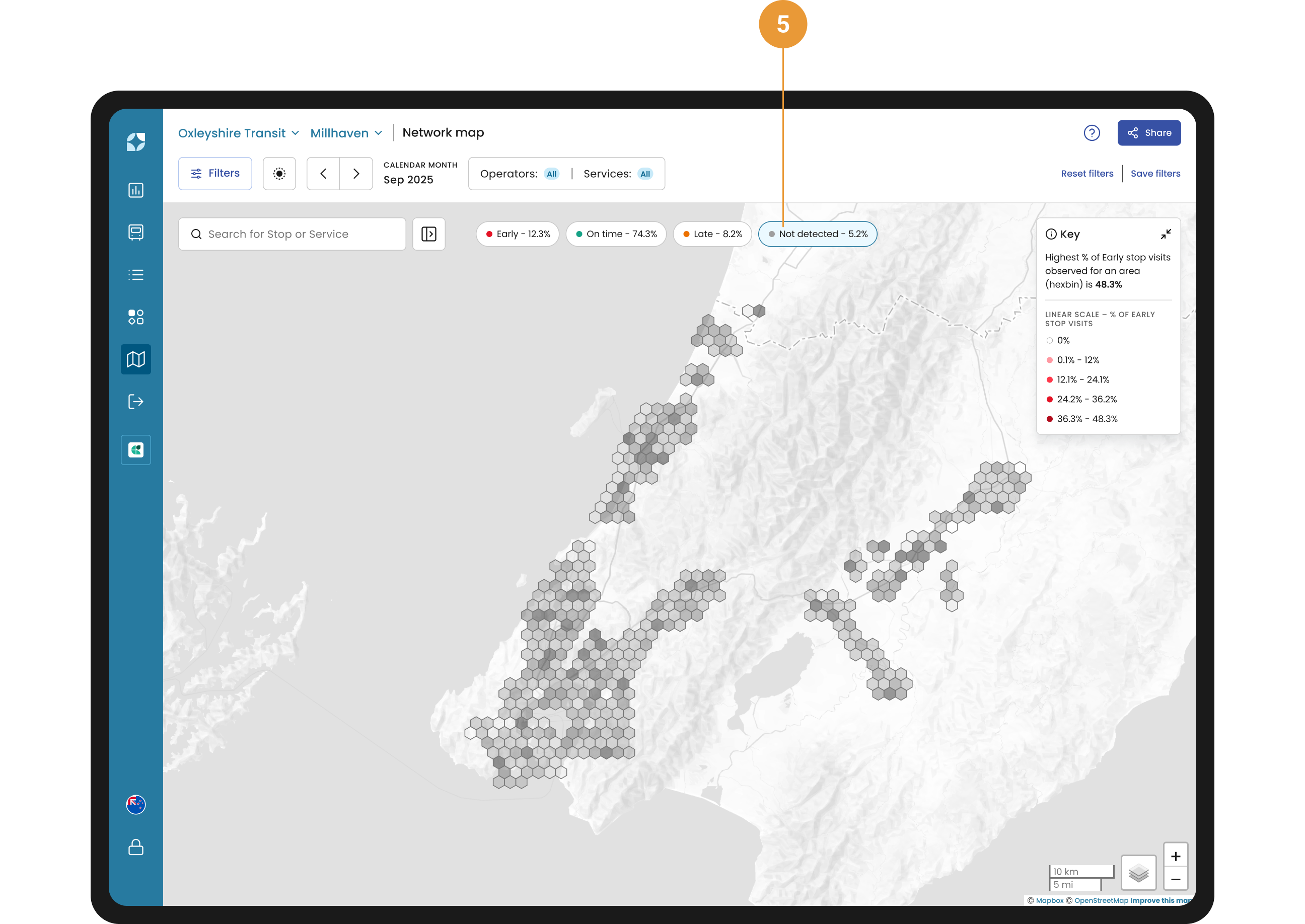
View the data quality across your network within the Network Map by selecting the “Not detected” chip and deselect all others (5). Each hexagon will be shaded based on the percentage of stops that were not detected.
Stop matching process
Each stop on a network is surrounded by a geofence. When a vehicle enters or exits a geofence, it leaves a trail of heartbeats in the data (purple triangles in the image below).
Mosaiq Insights analyses the heartbeat that departs from the stop and compares this to the scheduled time to draw conclusions on whether the vehicle is early, on-time or late.
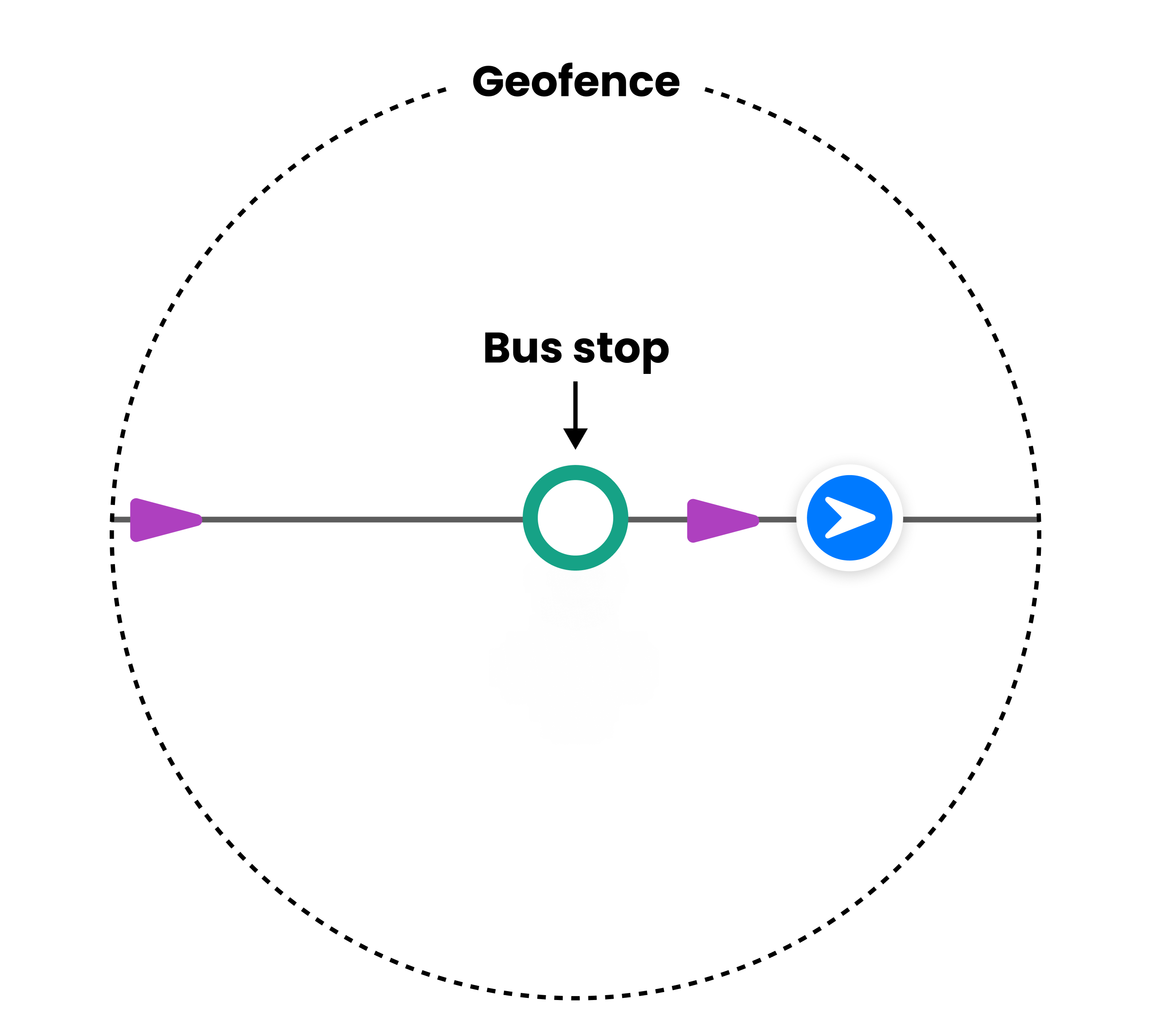
What is a geofence?
A geofence is a GPS-defined virtual geographic boundary that enables software to trigger a response when a device enters or leaves a specified area.
To improve stop matching for the first and last stop, we may use heartbeats from just before and just after the vehicle has tripped on or off the current trip to determine whether the vehicle is early, on-time or late. This ensures that each individual trip has the most accurate OTP for first and last stop and reduces the number of incomplete trips.
The quality of our stop matching is only as good as the data received. Therefore, our stop matching algorithm can be affected by factors such as equipment failure and failure of drivers to trip on/off.
Example #1: Toggling between percent and count
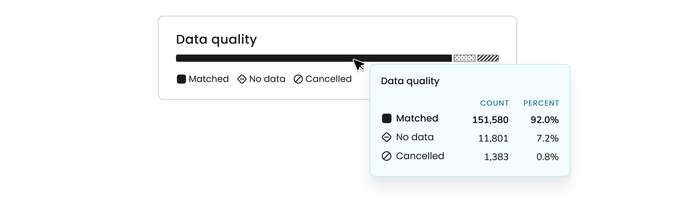
Within the data quality bar chart on the KPI dashboard, view either the percent and count figures using the tooltip. We can see that over 151,000 journeys have been matched from the real-time data to the schedule data, which equates to 92% data accuracy. On hover, a tooltip will also display both count and percentage for all data quality categories.
Example #2: Identifying an operator or route with poor data quality
Navigate to the Operators view to see which operators are contributing to the low matched percentage (poor data quality). Filter the "no data" column from largest to smallest to reveal the operators with the highest number of unmatched journeys.
This will provide an initial answer, showing the operators responsible for your poor data matching score. To investigate further, select the relevant operator and go to the Services view, which lists all services linked to that operator. Again, filter the "no data" column to identify the specific services causing the poor data matching score.
Once you have identified the problematic service(s), go deeper by accessing the Service Details view. Here, you can select a journey variant and review performance metrics for each stop along the route, such as on-time performance, punctuality, and reliability scores. This will help pinpoint stops with high "no data" counts that may be causing the issue.
To further analyse trends, navigate to the Journeys view and filter for trips with no data. This will allow you to identify patterns, such as issues occurring on specific days or times.
Not only does Mosaiq Insights answer your initial query, but it also supports deeper investigation, offering actionable insights that can help improve your data quality.