
The journey view shows in-depth details of a journey as well as the on-time performance, heartbeats, and passenger sentiment on a map.
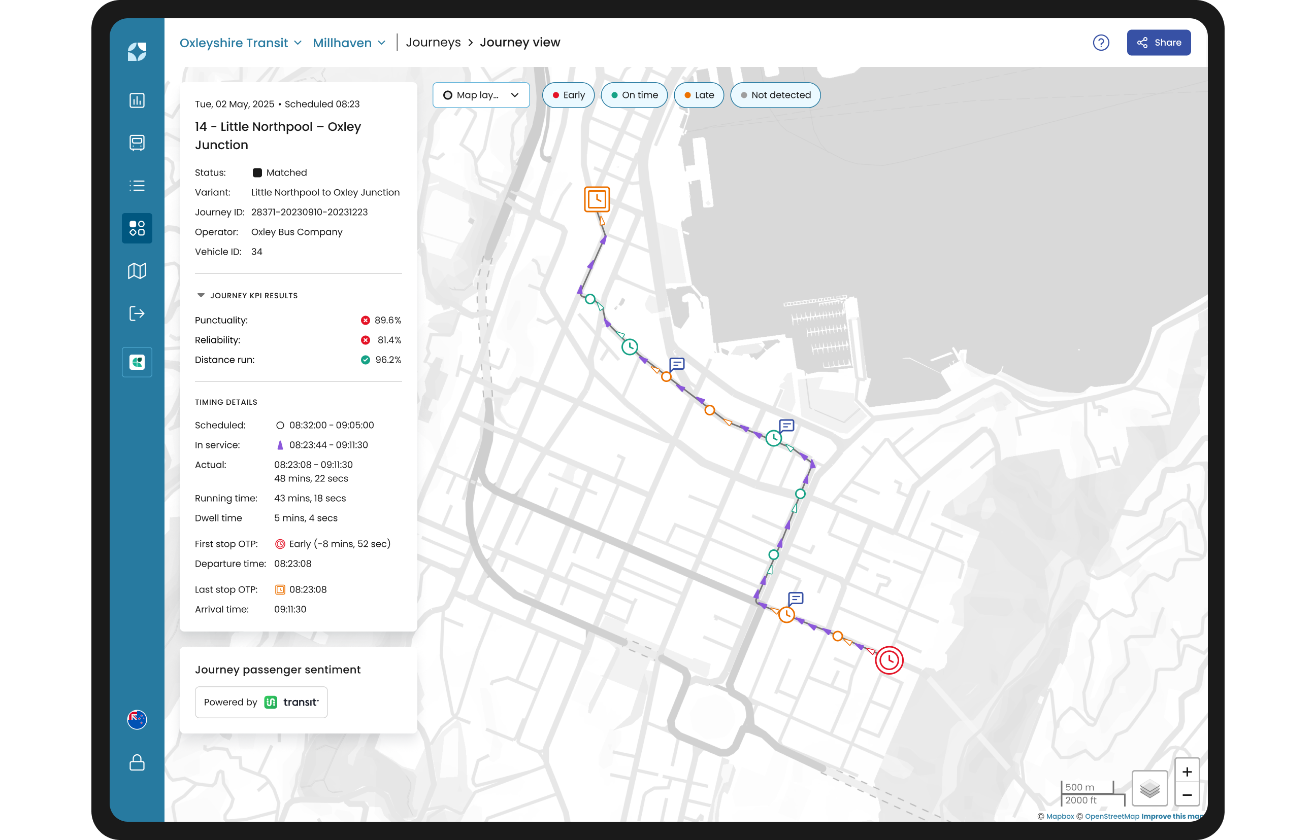
Global filters are not accessible on the Journey view since you are viewing a single trip.
Side panel
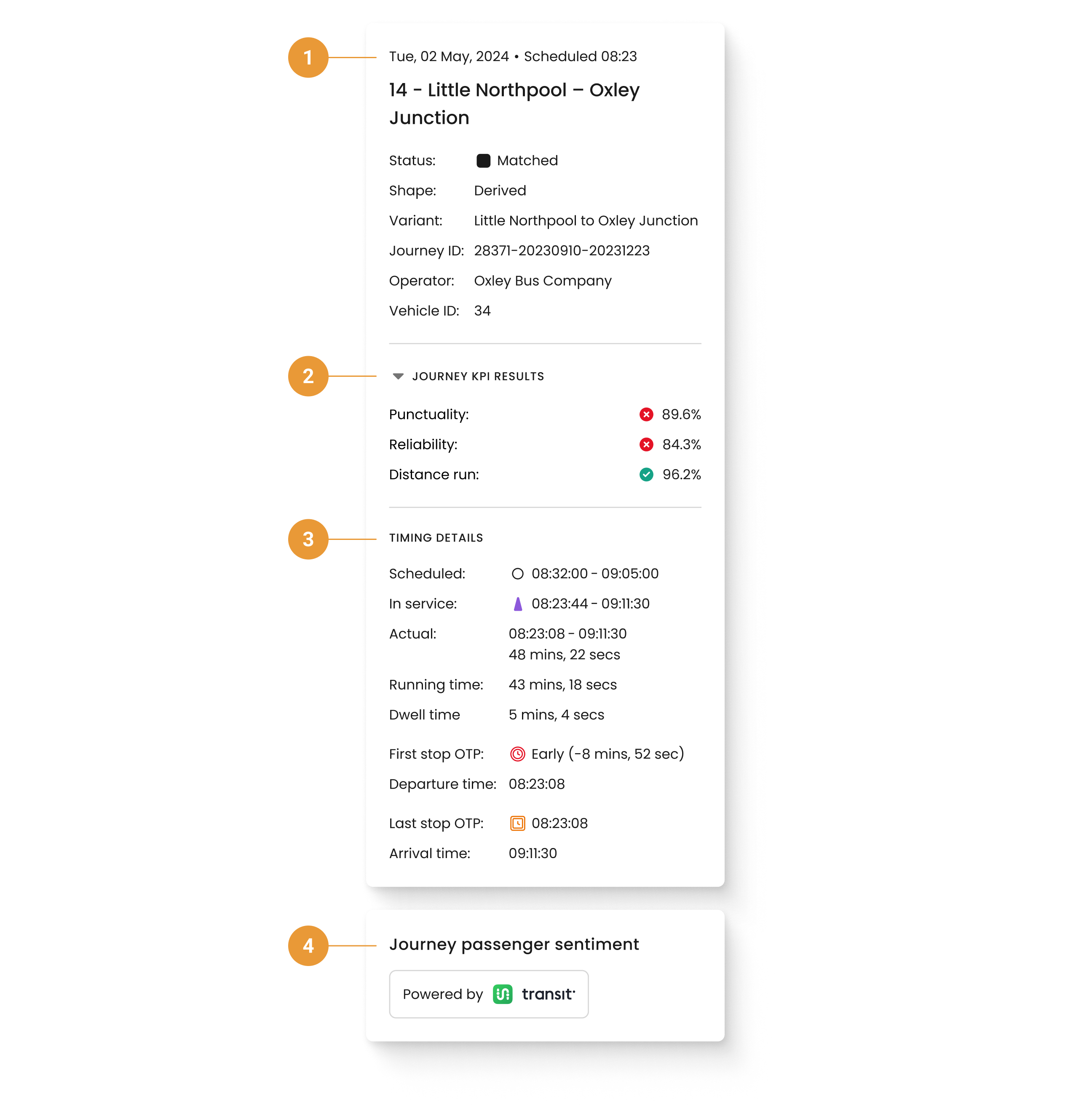
The side panel shows important identifying and performance information for the trip:
-
The top section (1) of the side panel shows a summary of the journey. In particular, the:
-
Journey date and scheduled time
-
Name of the journey
-
Status - indicates the status of the journey (matched, no data, cancelled, or part-cancelled)
-
Shape - indicates whether the shape is using derived shapes or not
-
Journey ID - unique identifier for the journey
-
Operator - name of the operator
-
Vehicle - indicates the vehicle’s identifiers (ID, label, or both)
-
The Status icon in the side panel is dynamic and matches the shape shown on the page. It can be one of the following status values:

-
Journey KPI results (2)
-
Punctuality - How is the default Punctuality KPI calculated?
-
Reliability - How is the default Reliability KPI calculated?
-
Distance run - How is the default Distance run KPI calculated?
-
-
Timing details (3)
-
Scheduled - this time range is the GTFS first stop departure time to the GTFS last stop arrival time
-
In service - first heartbeat time until the last heartbeat time
-
Actual - this time range is the first matched stop departure time to the last matched stop arrival time
-
First stop OTP - the Journey’s last stop on-time performance*
-
Departure time - the time that the vehicle was seen at the first stop
-
Last stop OTP- the Journey’s last stop on-time performance*
-
Arrival time - the time that the vehicle was seen at the last stop
-
*Please refer to the FAQs for more information on how on-time performance is defined.
The First stop and Last stop icons in the side panel are dynamic and match what is shown on the map. These can be one of the OTP values:

-
Journey Passenger sentiment tile (4)
Choosing layers on the map
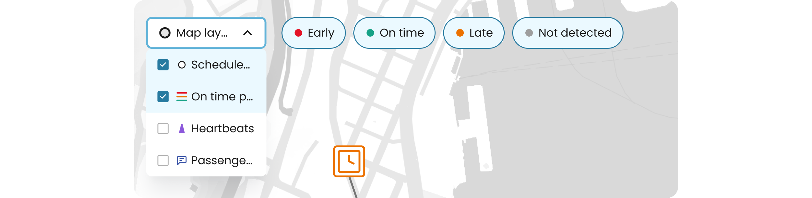
Scheduled stop, On time performance, heartbeats and passenger sentiment (when available), can be toggled on and off through the “Map layers” dropdown for customised combinations.
The “Early”, “On time”, “Late”, and “Not detected” buttons next to the “Map layers” dropdown will toggle visibility for the relevant timing points.
Icons on the map are all selectable and will show the relevant information for that timing point, stop, heartbeat, or passenger feedback.
If icons can’t be selected due to overlap, zooming in with the map should help make these icons individually selectable.
Deselecting all options will show the journey shape (if available).
Stop popover
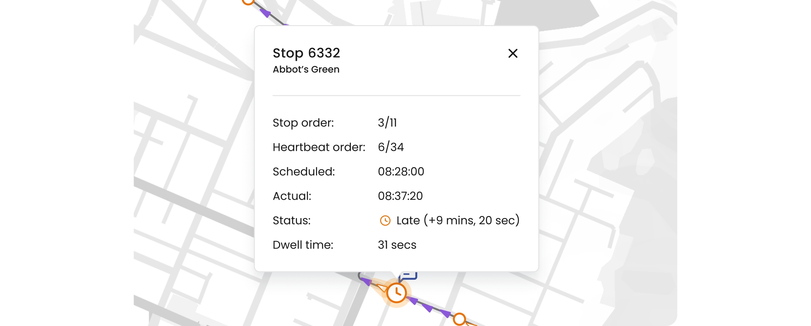
Clicking on a stop will open a popover that shows the ID, name, scheduled time, actual arrival time, and the status (or on-time performance).
Heartbeat popover

Clicking on a heartbeat will open a popover that shows the Vehicle’s identifiers (ID, label, or both) and Time of the heartbeat.
Passenger sentiment popover
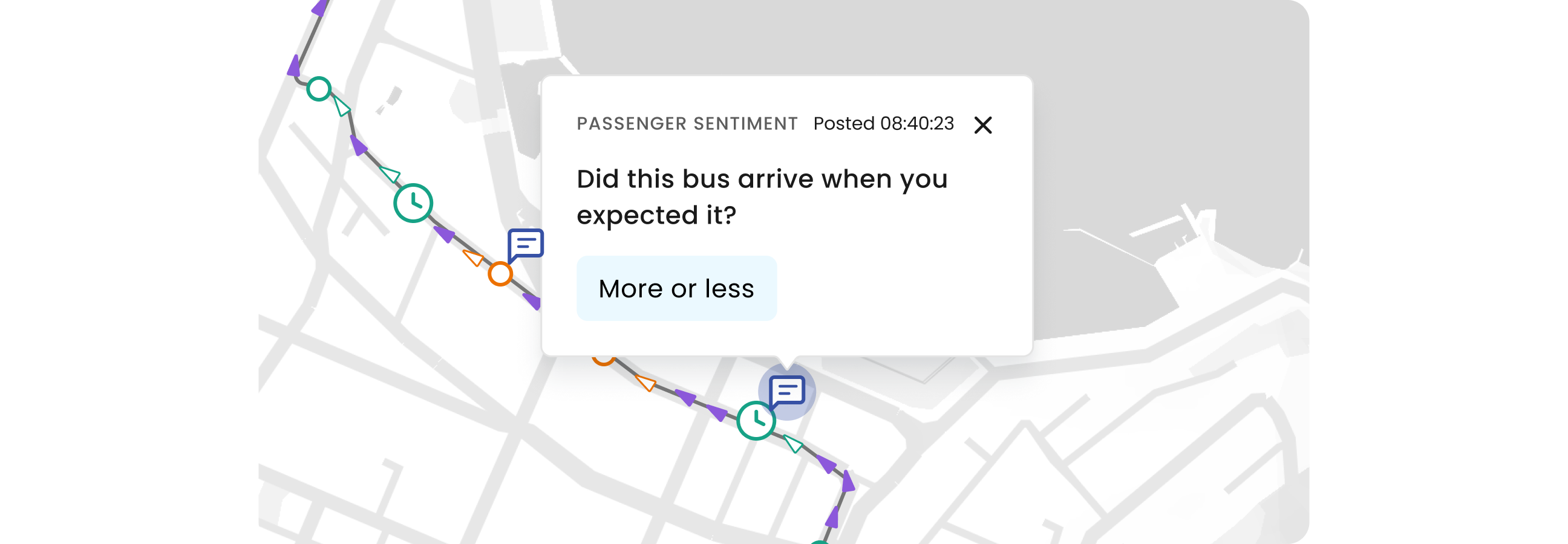
Clicking on a passenger sentiment icon will open a popover that shows the time it was captured, the question that was asked, and the received response.
Multiple icons can be selected on the map to compare information. To clear the popovers, deselect the corresponding icon in the “Map layers” dropdown.