
The Distance run (cumulative) chart shows an accumulation of total distance scheduled and total distance run throughout the selected period, visualising the gap above or below the target over time.
This view helps you understand the accumulated distance run by each operator or service, providing an understanding of whether or not targets are likely to be met for a given period.
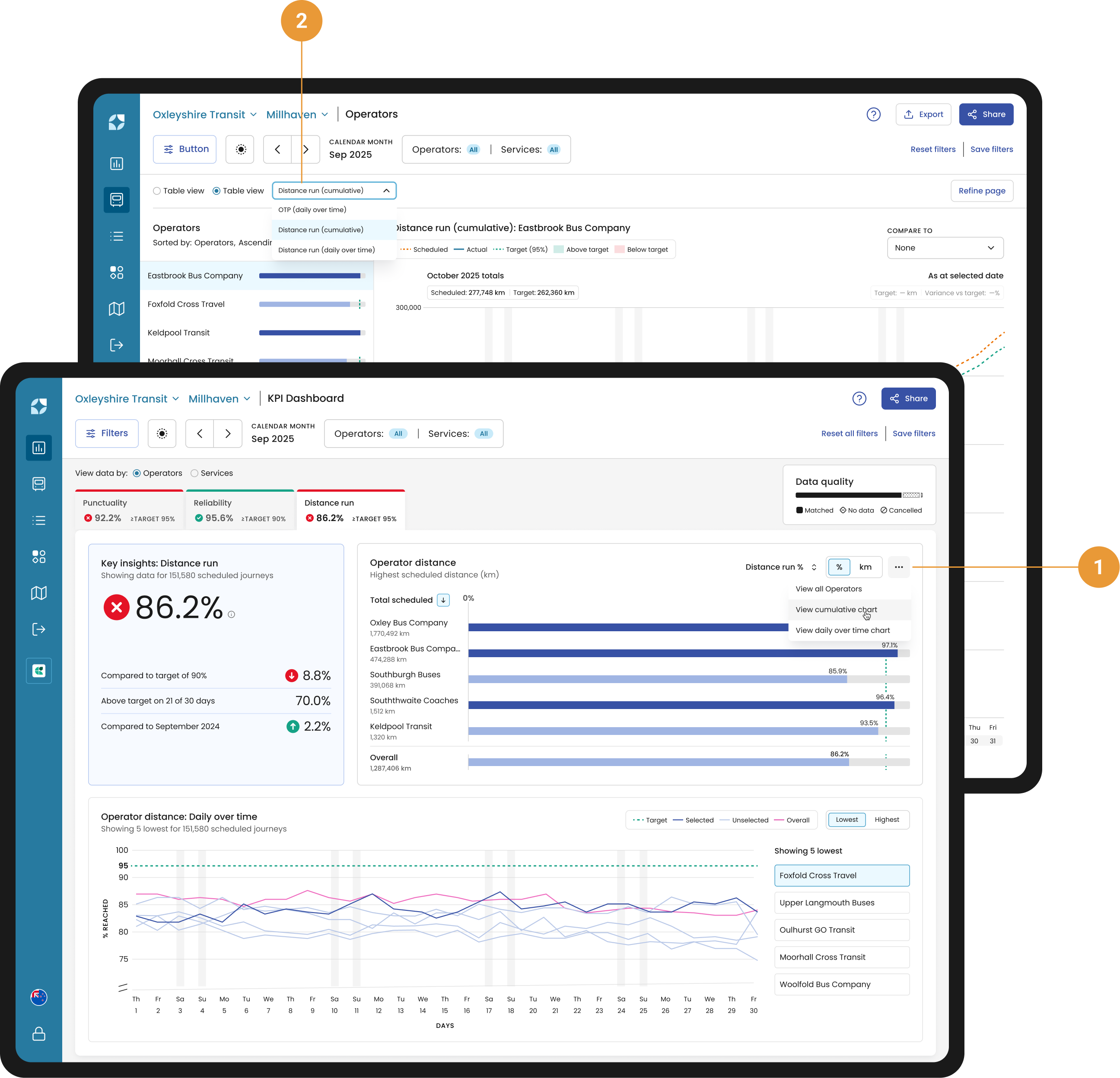
You can access the Distance run (cumulative) chart from the KPI widget (using the overflow dropdown) (1), or via the Chart view dropdown in the header (2).
Chart controls
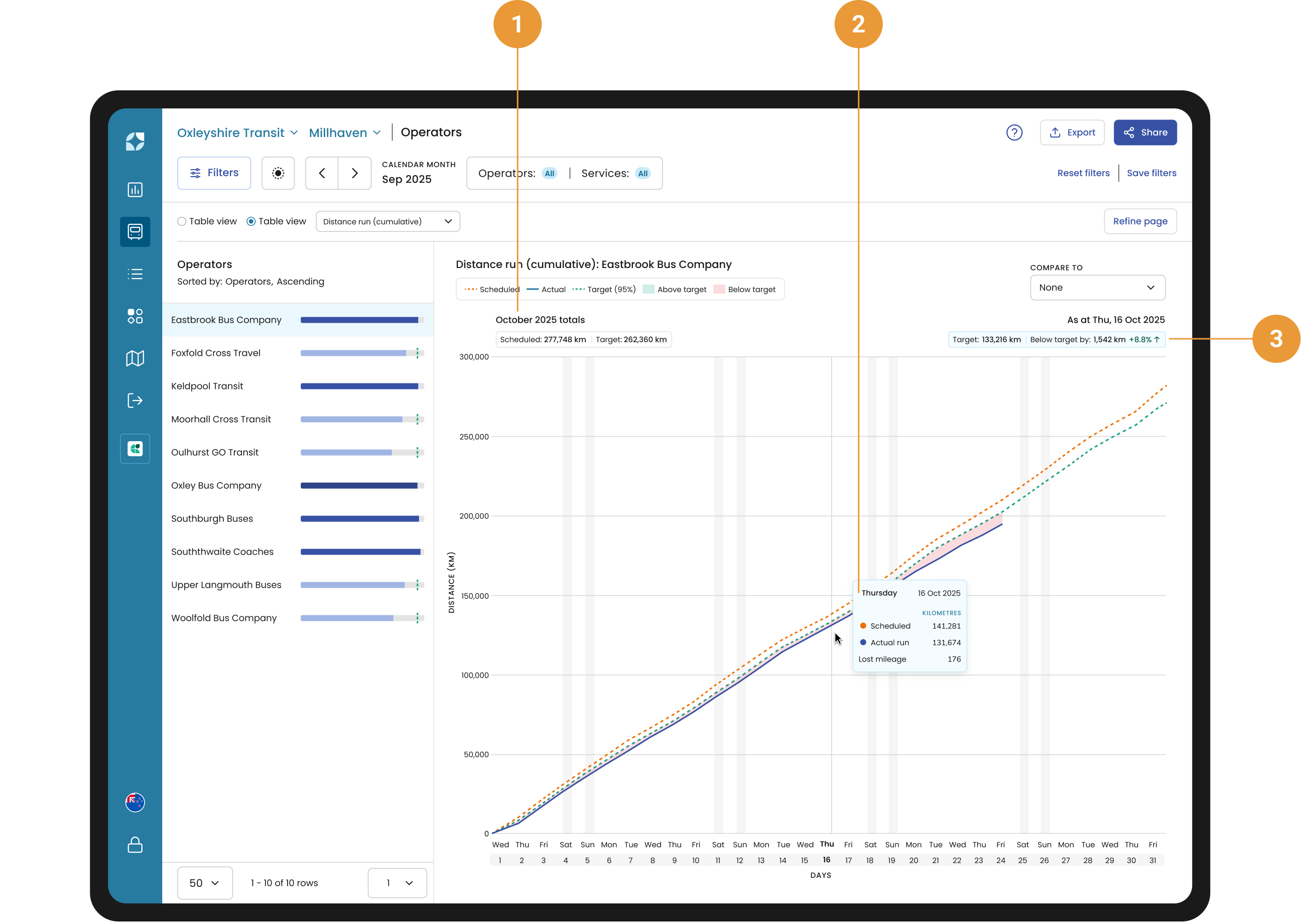
The Distance run (cumulative) chart is a burn-up style chart showing distance figures increasing as they accumulate over time. The summed totals for the period appear under the chart title (1).
Hovering over the chart displays a tooltip with your Scheduled and Actual distance run as accumulated figures up to the hovered day (2). The accumulated target distance, along with the distance above or below that target in units and percentage, is shown above the chart, directly beneath the hovered date (3).
Sidebar
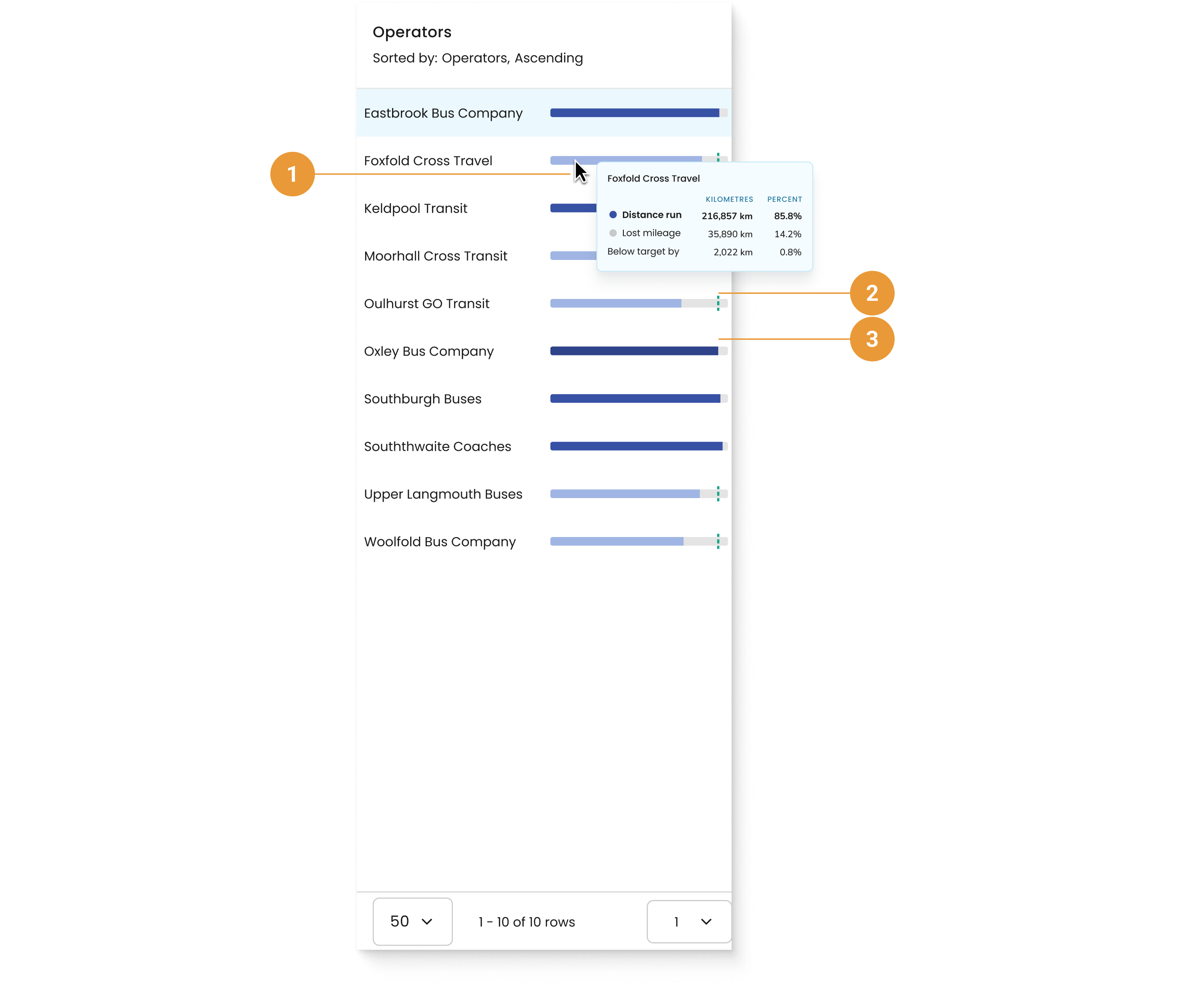
You can hover over an operator or services distance bar to see a tooltip (1) with total distance run, lost mileage and variance from the target displayed in both distance units and as a percentage of scheduled distance for the selected period.
-
When the Distance is under target, the bar is light blue and a target line is visible (2).
-
When the Distance is over target, the bar turns dark blue and the target line is not shown (3).