
The Distance run (daily over time) stacked chart shows total distance scheduled and total distance run each day, in both units and as a percentage of scheduled distance against your distance target.
This dual-chart view lets you quickly see whether each operator or service is meeting, exceeding or falling short of its planned distance over the selected period. This helps you monitor service delivery, identify under‑ or over‑servicing, and track performance trends over time.
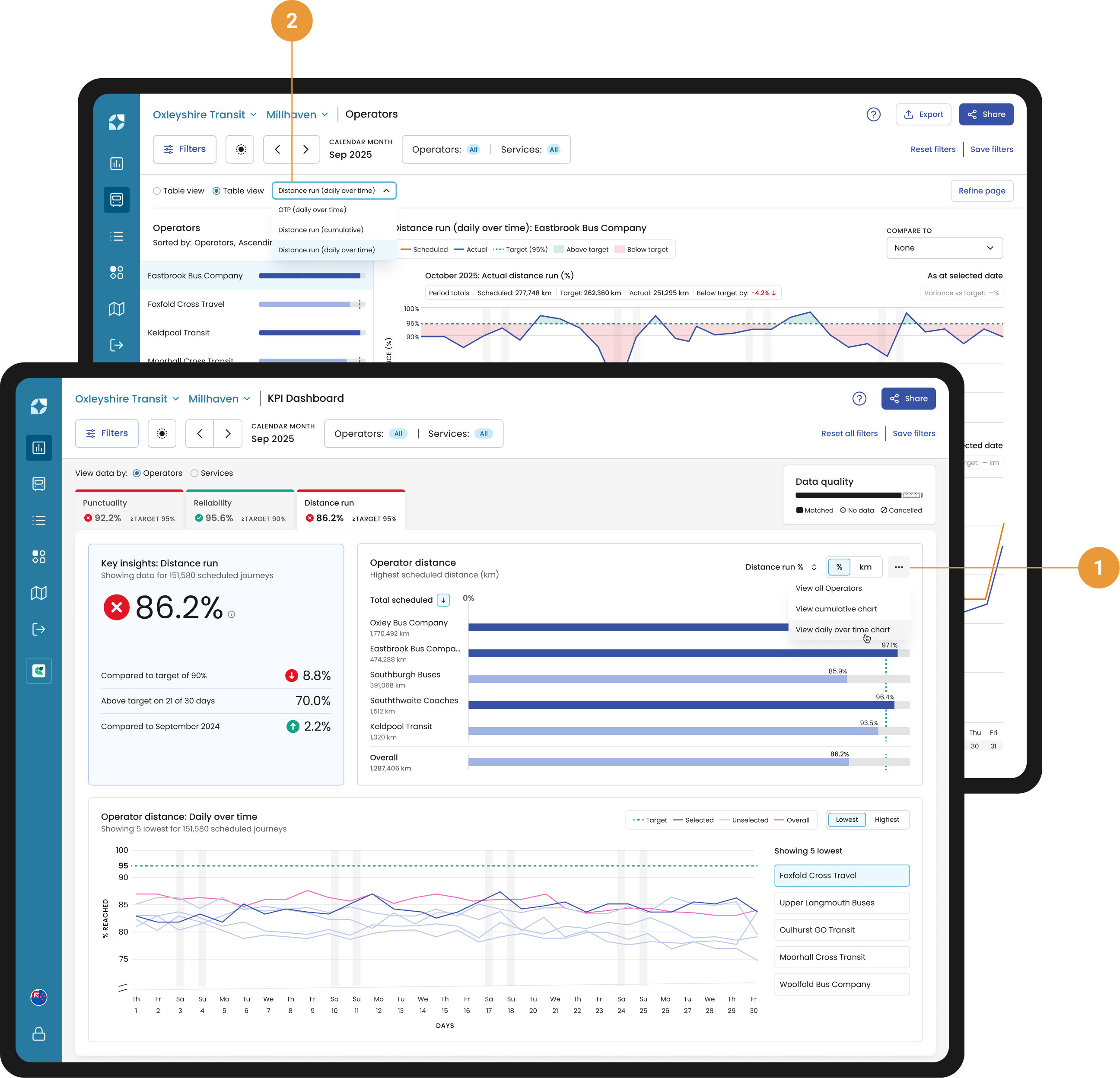
You can access the Distance run (daily over time) chart from the distance KPI widget (using the overflow dropdown) (1), or via the Chart view dropdown in the header (2).
Chart controls
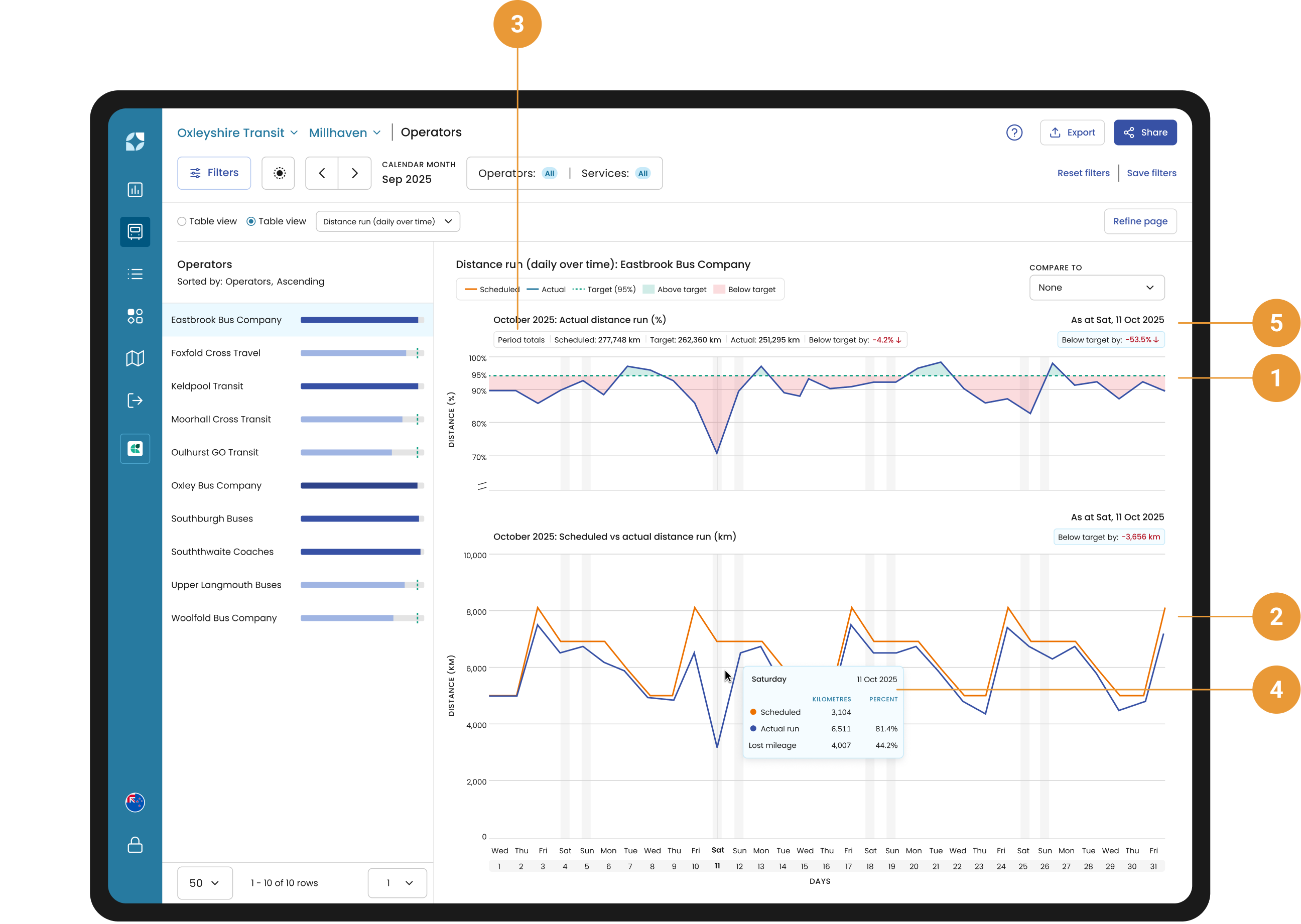
Distance run (daily over time) is a stacked chart, with Actual distance run as a percentage at the top (1), and Scheduled and Actual run in units below (2). The summed totals for the period are available under the chart title (3).
As you hover over either of the charts, the tooltip will display your Scheduled distance, Actual distance run and Lost mileage in both units and as a percent of total scheduled for that day (4). The distance to/from your target distance run, along with the selected day, is displayed in units and as a percentage above each respective chart (5).
Compare
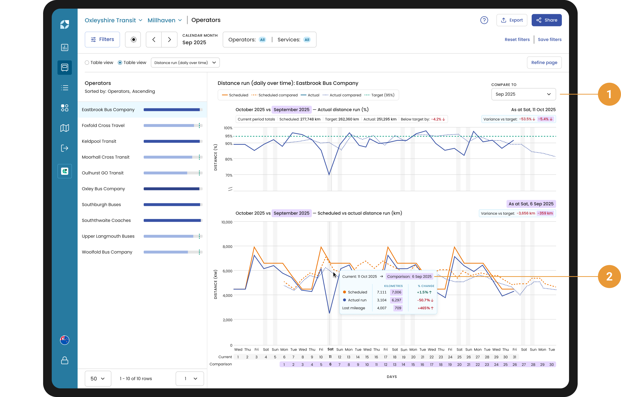
You use the compare function (1) to compare the current period with one of twelve previous periods in correspondence to the current date range selected.
For example, if you have selected March 2024, it will compare February 2024, January 2024, December 2023 and so forth – the last entry will be March 2023.
Or if you have selected calendar weekday Mon 4 Dec 2023 to Fri 8 Dec 2023, the compare to drop down will show Mon 27 Nov to Fri 1 Dec 2023, Mon 20 Nov to Fri 24 November and so forth – the last entry would be Mon 11 to Fri 15 Sep 2023.
The chart tooltip will give you the Scheduled distance, Actual distance run and Lost mileage for both periods, with a percentage change (2).
Sidebar
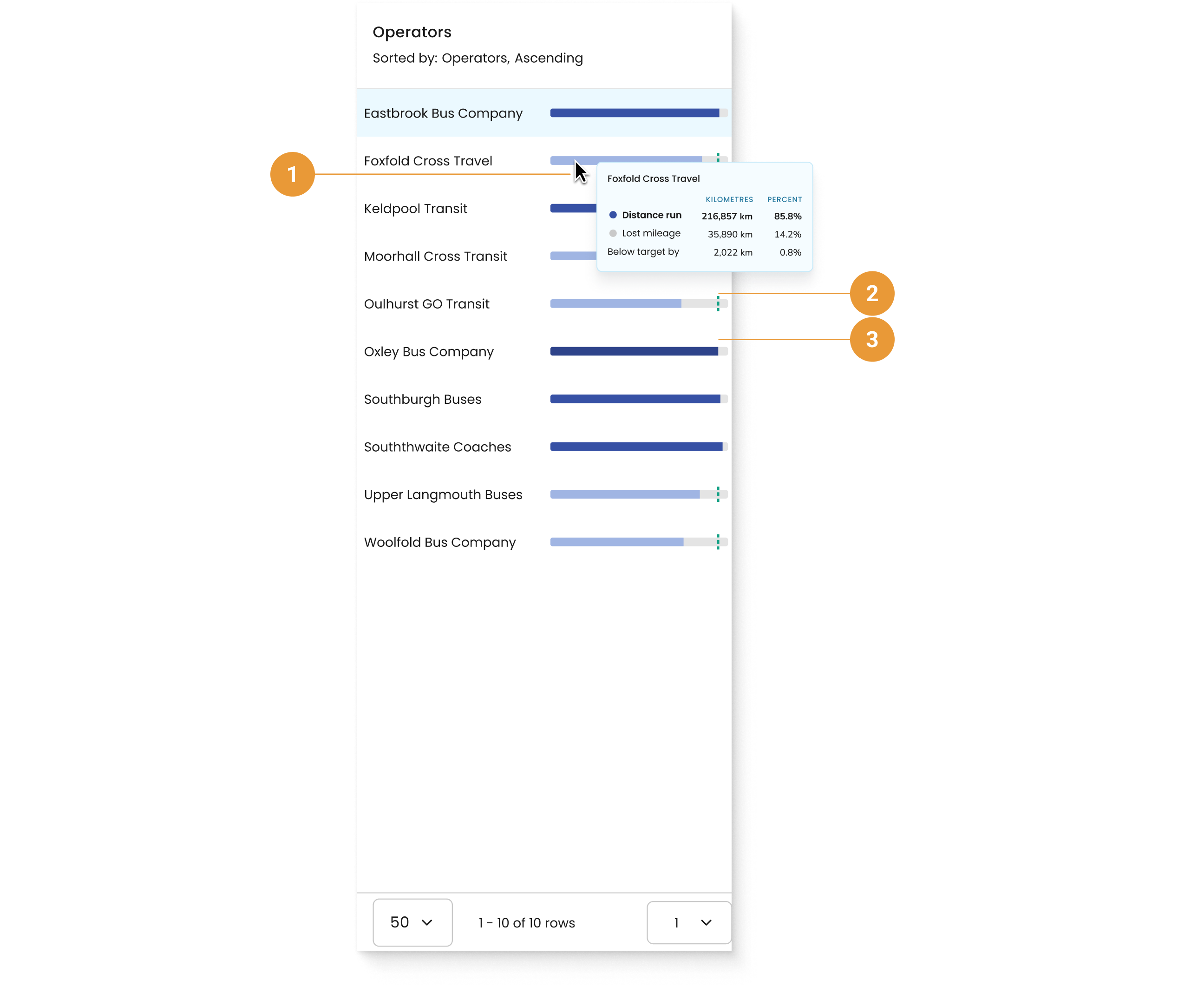
You can hover over an operator or services distance bar to see a tooltip (1) with total distance run, lost mileage and variance from the target displayed in both distance units and as a percentage of scheduled distance for the selected period.
-
When the Distance is under target, the bar is light blue and a target line is visible (2).
-
When the Distance is over target, the bar turns dark blue and the target line is not shown (3).