
The On-time performance (OTP) daily over time chart provides a visualisation of First stop, Timing point and Last stop on-time performance for operators or services over a period of time.
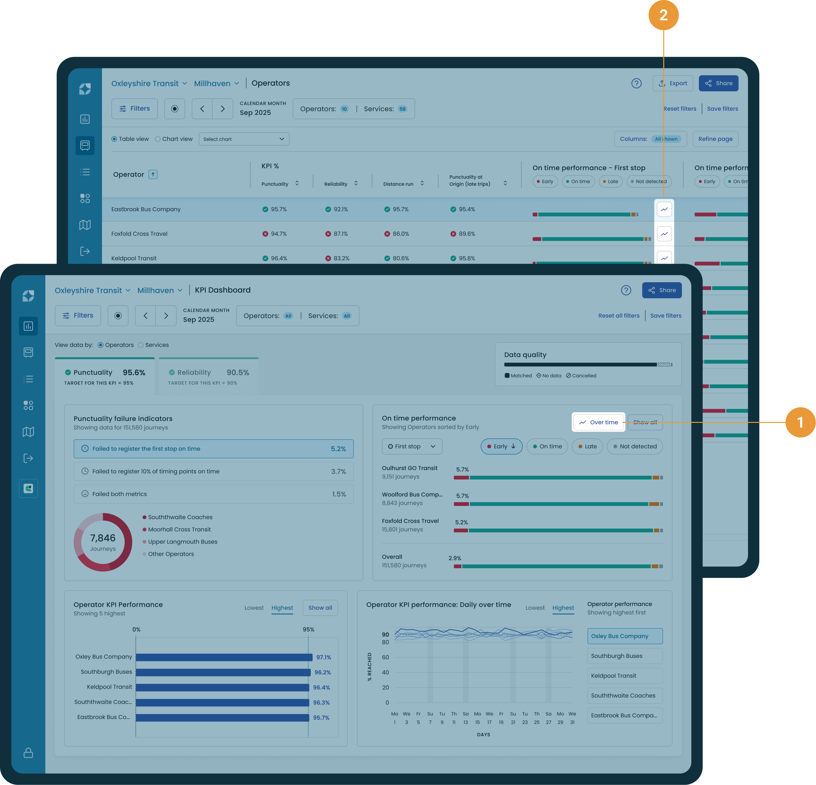
The OTP over time chart can also be accessed by either selecting the “Over time” button on the KPI Dashboard (1), or by clicking the chart buttons in each column (2).
Chart controls
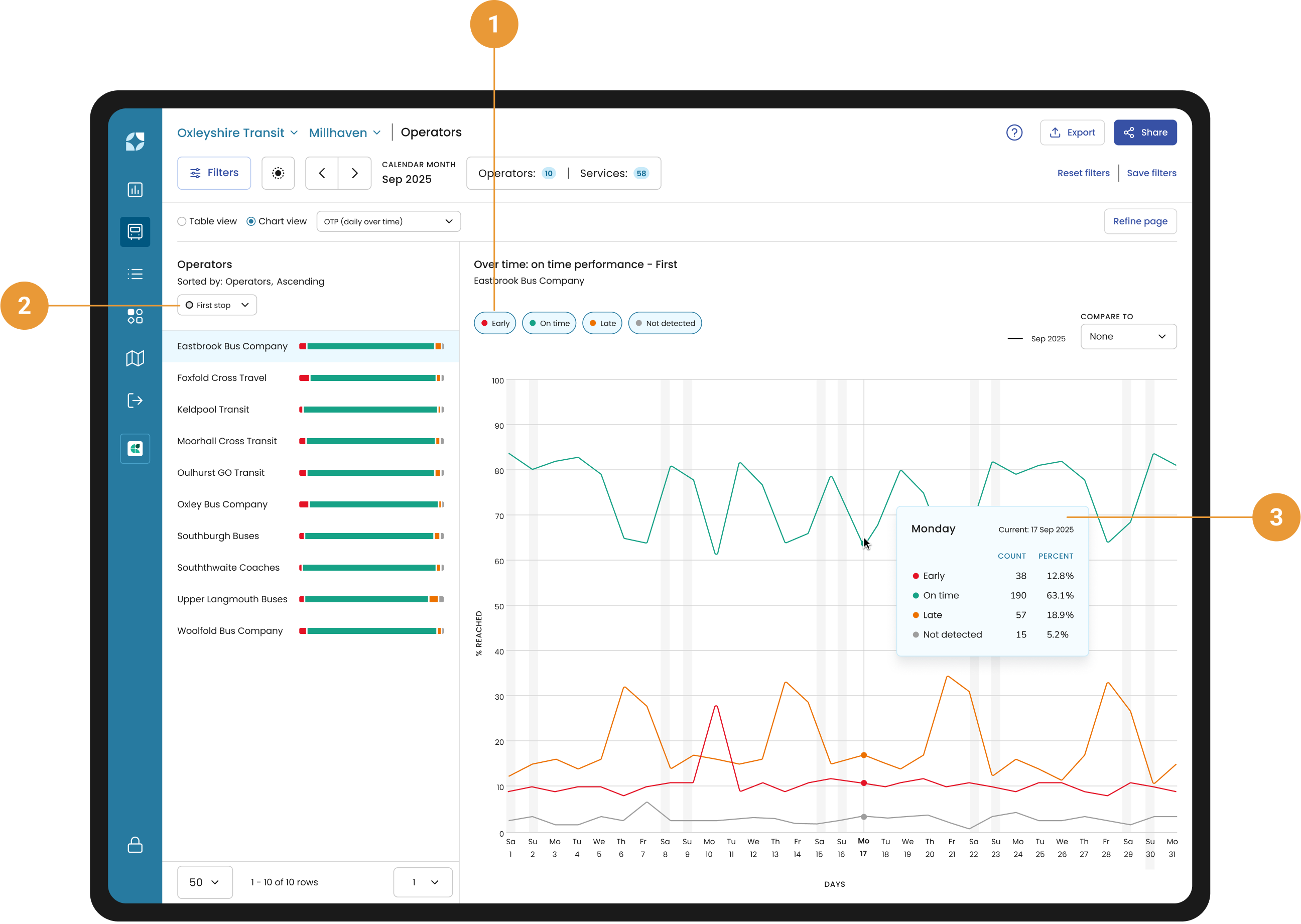
By default Early, On time, Late and Not detected are selected. Use the toggles to control what is visible in the chart (1).
First stop, Timing point or Last stop view (2) in the side panel is a reflection of the Table view and can be changed by selecting the dropdown.
Hovering over the chart will show the date, exact number and the percentage of Early, On-time and Late on that particular date (3).
Compare
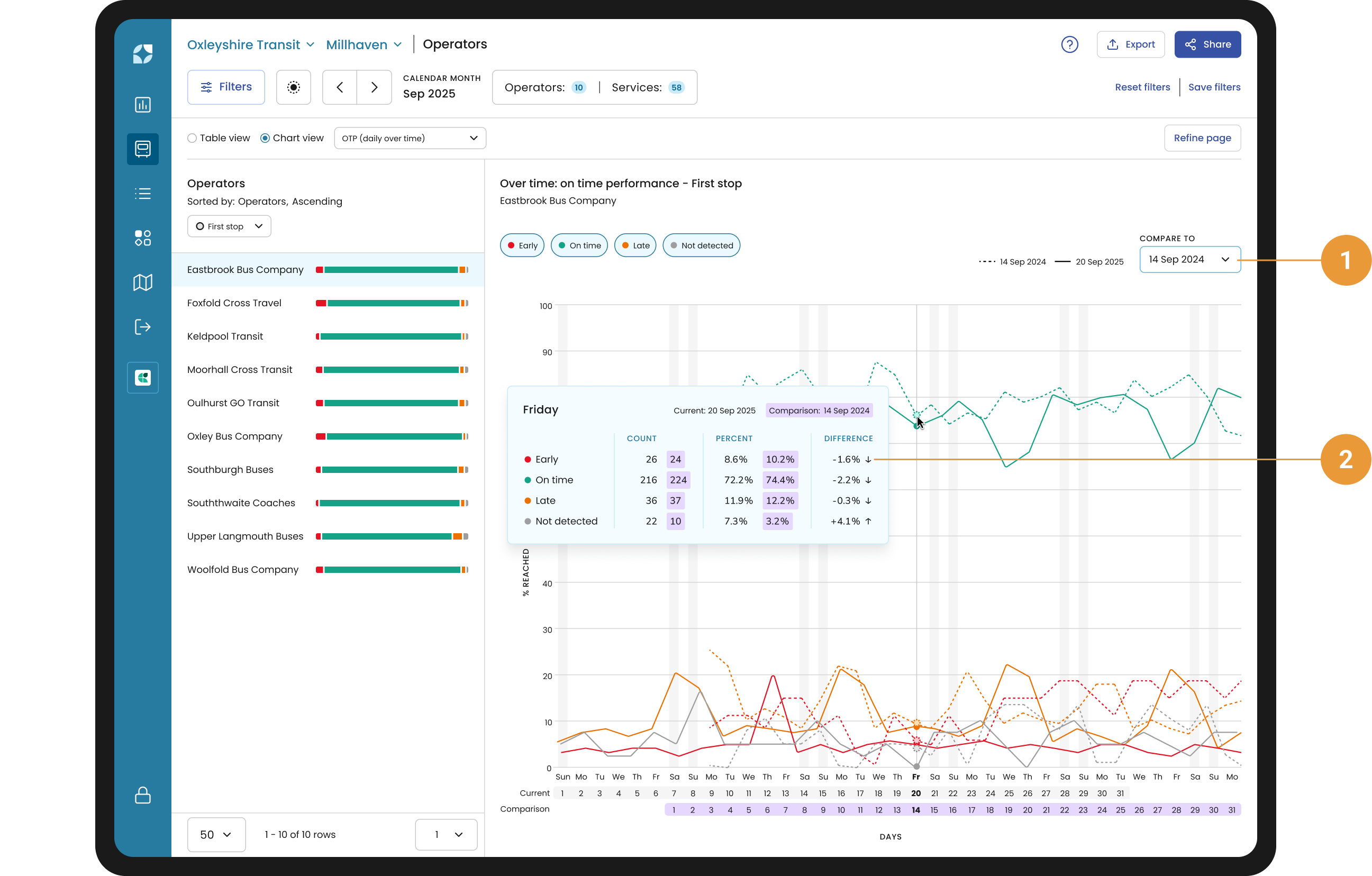
You use the compare function (1) to compare the current period with one of twelve previous periods in correspondence to the current date range selected.
For example, if you have selected March 2024, it will compare February 2024, January 2024, December 2023 and so forth – the last entry will be March 2023.
Or if you have selected calendar weekday Mon 4 Dec 2023 to Fri 8 Dec 2023, the compare to drop down will show Mon 27 Nov to Fri 1 Dec 2023, Mon 20 Nov to Fri 24 November and so forth – the last entry would be Mon 11 to Fri 15 Sep 2023.
The chart tooltip will give you the Early, On-time, Late and Not detected for both periods, as a count and percent, with a percentage change between periods (2).
Side panel
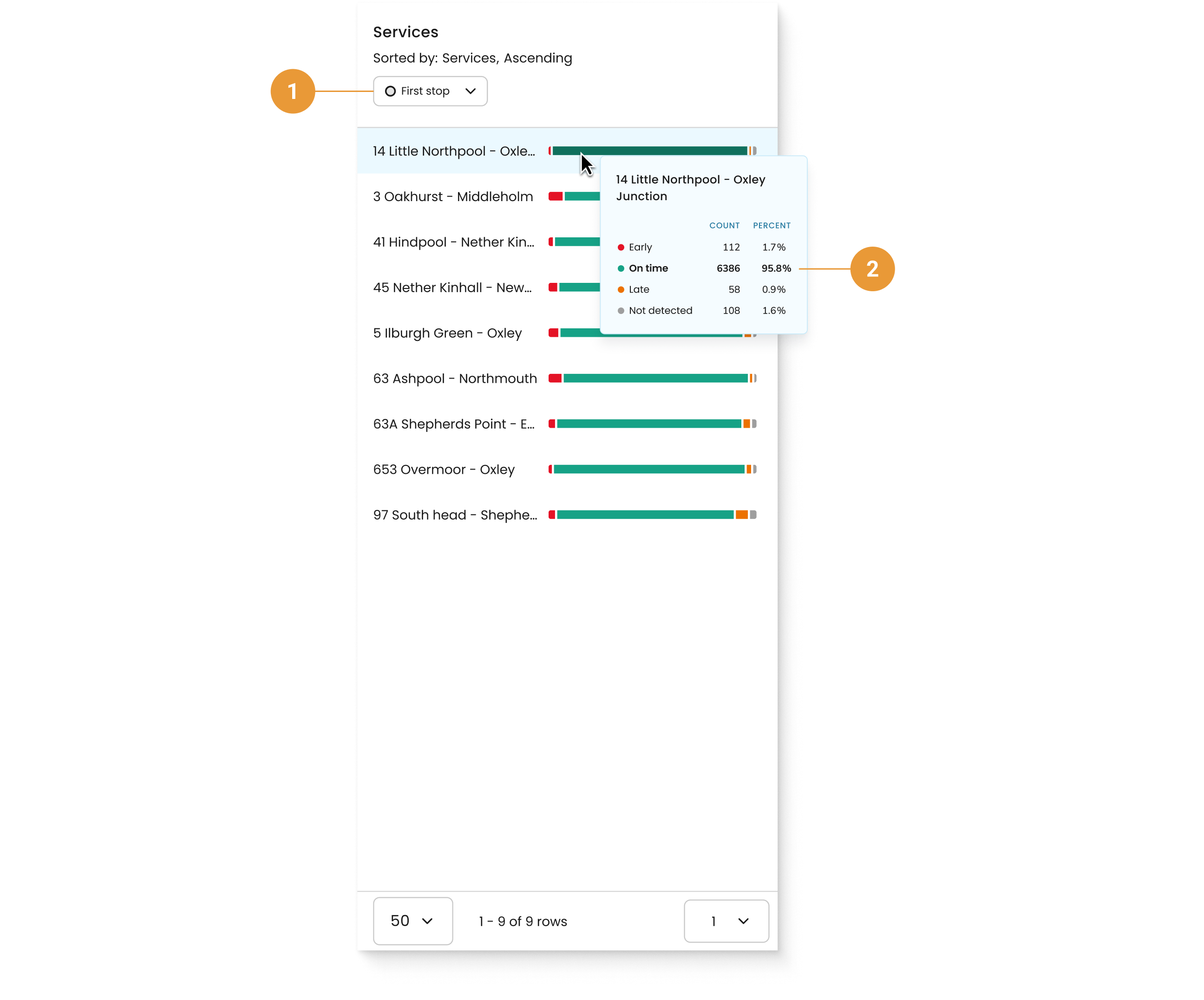
Use the dropdown to view OTP by stop types (1). Hover over an OTP bar to view a tooltip with the percentage and count for each OTP indicator (2).