
The Performance over time view in the Network map provides an alternative way to explore on-time performance. Instead of a single snapshot, you can track how performance changes over time and compare two periods directly. Use this view to check whether a hotspot cleared, spread, or shifted, or to measure the impact of operational changes (such as a new timetable) against a baseline period.
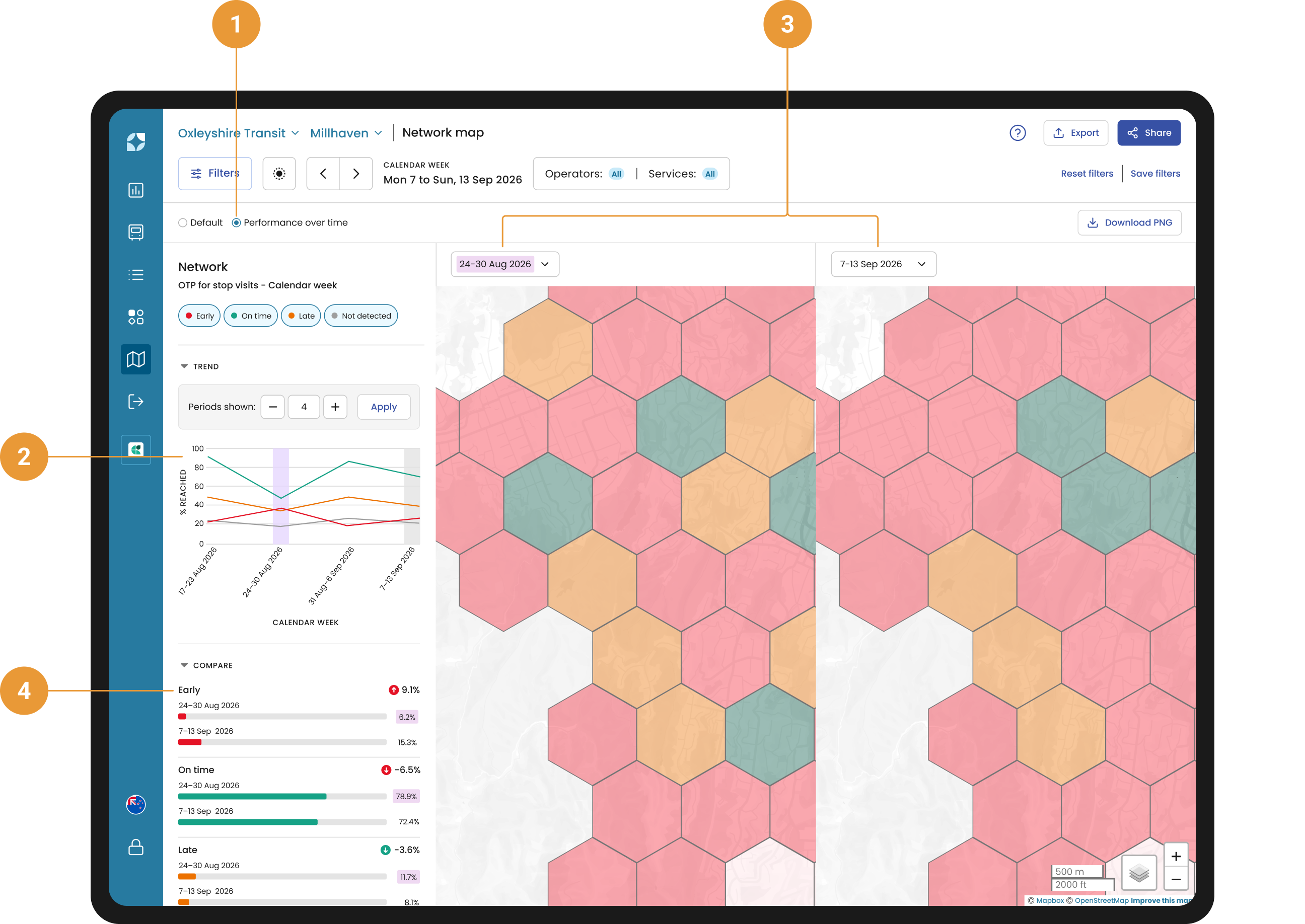
Switch to Performance over time in the filter sub-panel (1) to view a trends across Early, On time, Late, and Not detected (EOL) categories over multiple periods (2). Select any two periods to compare them side by side: two Network maps display (3), one for each period, alongside a breakdown showing how performance shifted between them (4).
Side panel overview
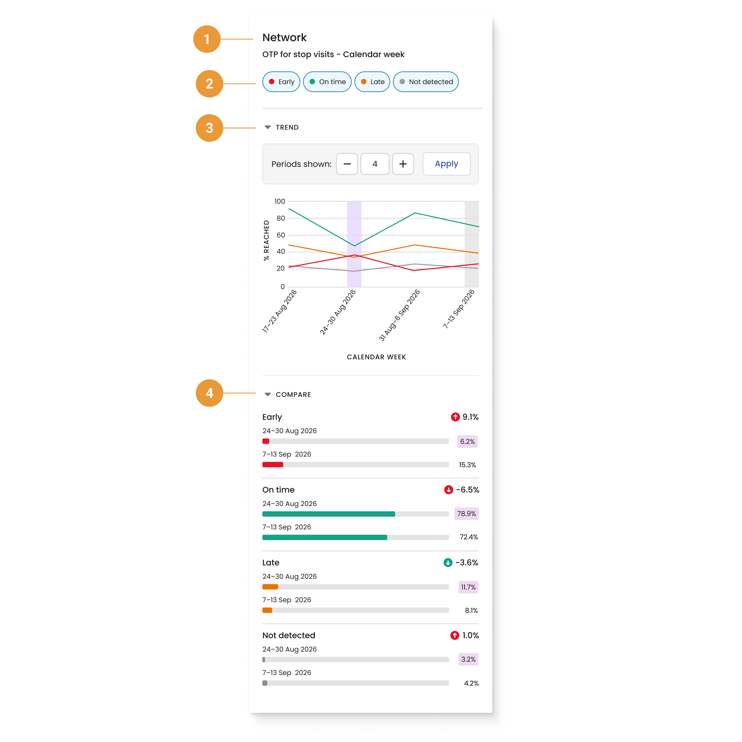
An interactive side panel shows key details about performance over time, based on your current selections:
-
Selection header (1) - provides context as to what has been selected to view (such as network, a single stop or service name) and how the on-time performance is aggregated (such as by Calendar month). You can control what on-time performance is displayed by toggling the EOL* chips shown at the top of the side panel (2). By default, Early is selected.
-
Trend (3) - displays EOL performance trends over time, and reflects the date range and exclusions set in the filter hub. For example, choose Calendar month to plot monthly performance or Calendar week to plot weekly performance. Adjust how far back the trend shows by changing the number of periods with the plus and minus buttons or by typing a number and clicking Apply. The selected comparison periods are highlighted on the graph.
-
Compare (4) - allows you to view the percentage change of each of the EOL categories between the two comparison periods selected. The change up/down coloured arrow reflects whether the comparison between the two selected periods is favourable, not just its direction, so Lateness decreasing reads differently to On-time decreasing. The value of each selected EOL is also displayed in a small bar for each comparison period. The compare section of the side panel will only be displayed when you have selected two comparison time periods.
*Please refer to the FAQs for more information on how EOL is defined.
Dual maps window
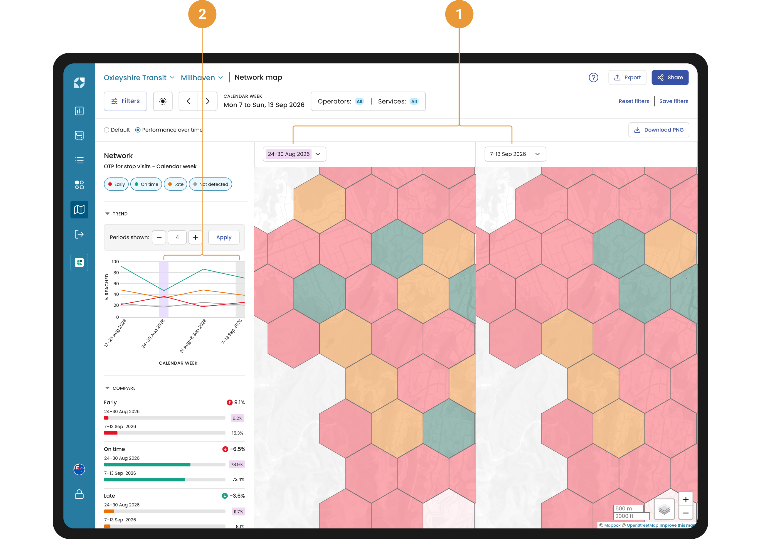
Use the dropdowns above the map windows to select time periods to compare (1). By default, no comparison periods will be selected. The trend graph highlights the time periods you have chosen to compare (2).
The maps are synced so that if you do any of the following on one map the other will reflect the same view:
-
Zoom in/out
-
Click a specific hexbin or stop
To compare the performance for a single service, or number of services, either:
-
Select the route from the filter hub, or
-
Click on that route when on the Default view, before navigating to the Performance over time view.