
The KPI performance charts let you quickly assess performance across your network and selected filters. This page explains how to read and interact with each chart type, from key insights to detailed daily trends and on-time performance by stop type.
Key insights
Key insights at a glance are available for every KPI based on your selected filters.
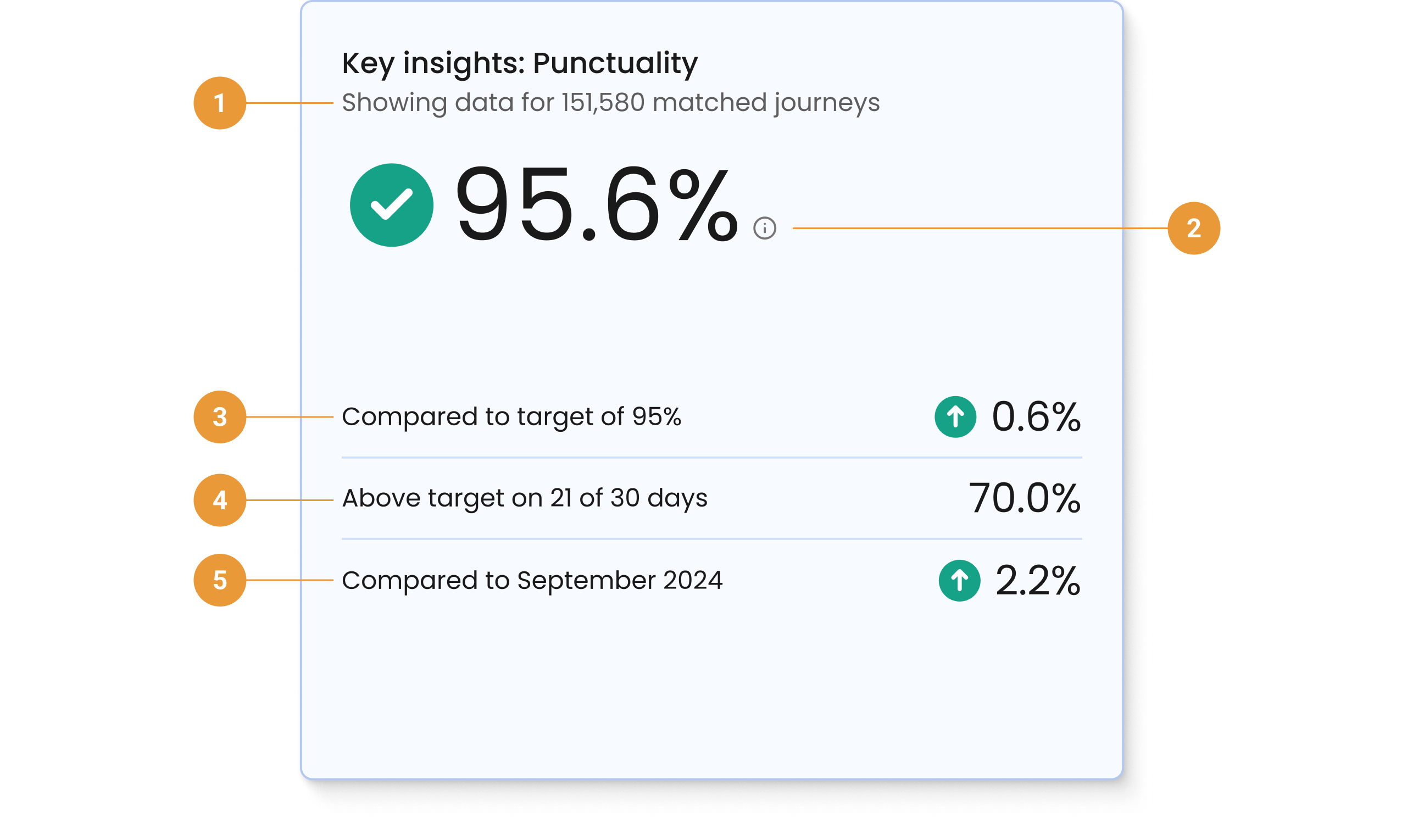
The key insights are based on your selected filters and help you quickly understand:
-
How much data is being used to generate your insights (1)
-
What this KPI means (2). Hover over the information icon to get a short description for the selected KPI.
-
How well your selected KPI is performing against the default target (3). Note that the default target is set at onboarding.
-
How many days in your selected time period that KPI performance was above the target (4)
-
The difference in performance from the current selected date range to the previous period (5)
KPI performance: Highest/lowest
The KPI performance highest/lowest bar chart shows the top five highest, and top five lowest, performing operators or services in terms of the KPI you have selected.
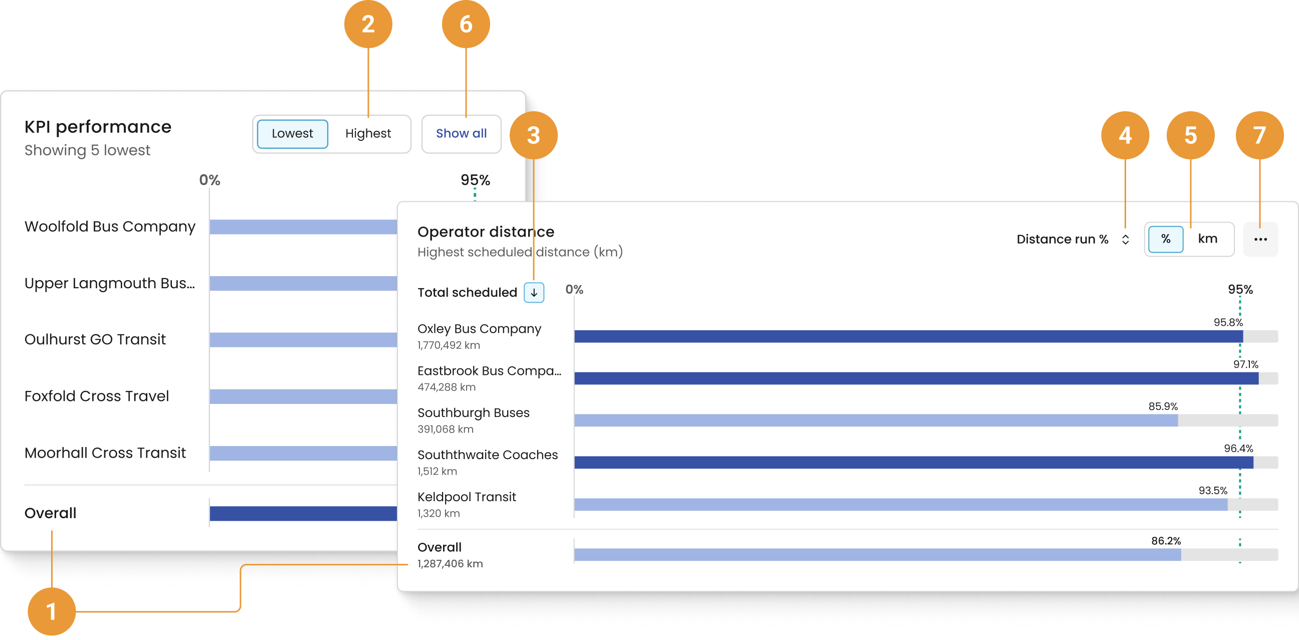
Your overall performance, based on your selected filters, is displayed at the bottom of the chart (1). When viewing the Distance run KPI, your total scheduled distance is also displayed.
The KPI performance chart defaults to highlighting the five lowest performing operators or services based on your selected filters. To view the five highest performing operators or services for the selected filters, click “Highest” (2). Within the Distance run tab, you can sort to view highest or lowest by total scheduled distance (3), or distance run (4). You can also toggle the displayed number units between percent and kilometres (5). Changing the unit only changes the display, not the sorting order.
The “Show all” button takes you to the appropriate Operators or Services page (6). When viewing the Distance run KPI, select the overflow menu to access more options (7). From here, you can navigate to the distance cumulative chart, distance daily over time chart or navigate to the Operators or Services page.
KPI performance: Daily over time
The KPI performance: Daily over time chart shows daily KPI data for the five highest, or lowest, performing operators or services over a selected period of time.
The performance data is shown by day for your selected period.
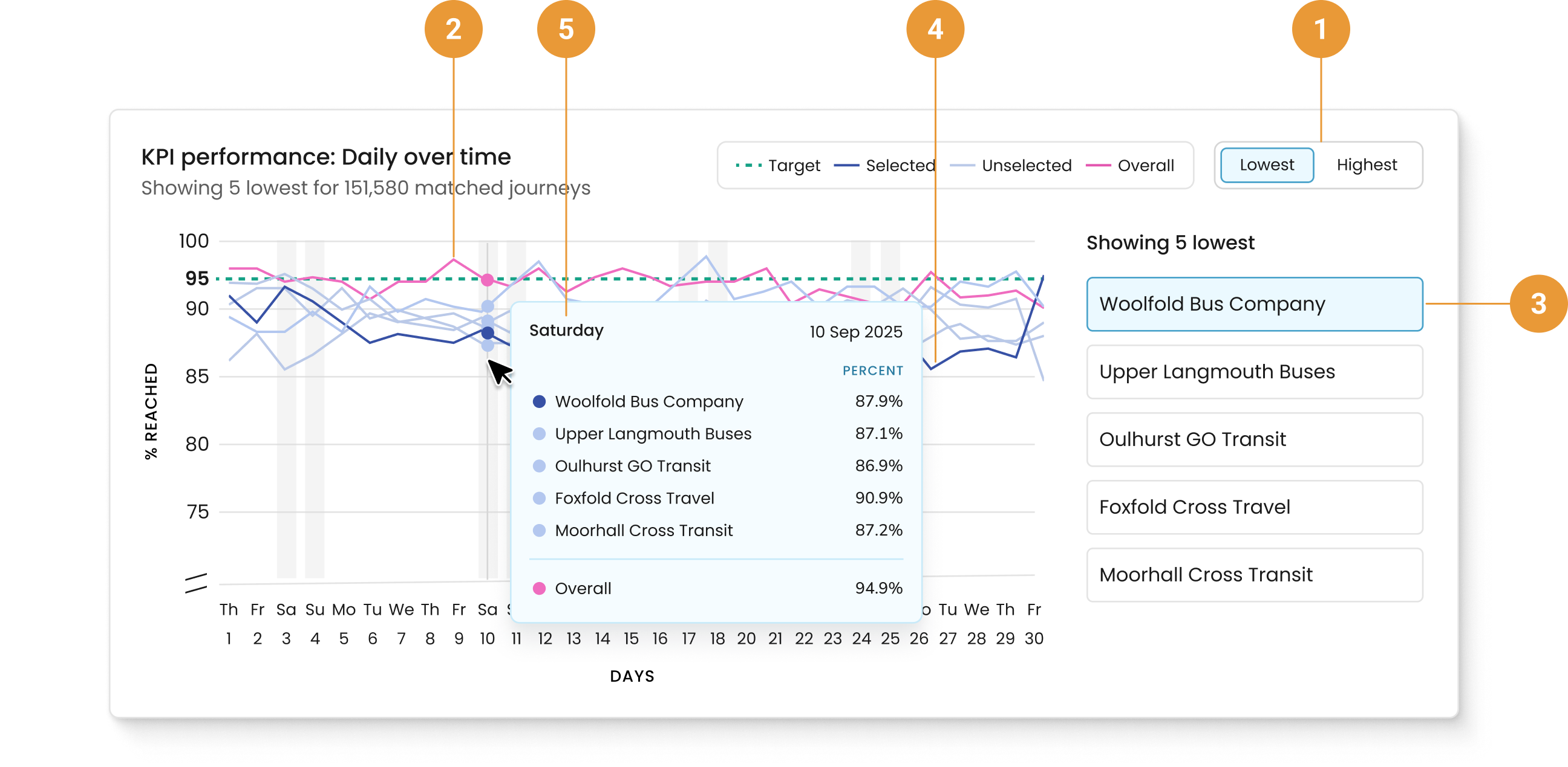
Toggle to select either the five highest, or lowest, performing (1) operators or services for the selected date range. Your overall performance, based on your selected filters, is displayed alongside your highest and lowest performers (2).
The operator or service selected to the right of the container (3) has its data line highlighted in the line graph on the left (4).
Hovering over the line graph reveals details specific to that day (5), including the operator or service selected and their respective percentages, plus the date.
On time performance
The On time performance chart is displayed for all KPIs categorised as Punctuality. It displays the combined on-time performance based upon the operators and services that have been selected in the filter hub. Please refer to the FAQs for more information on how early, on time, late, and not detected are defined.
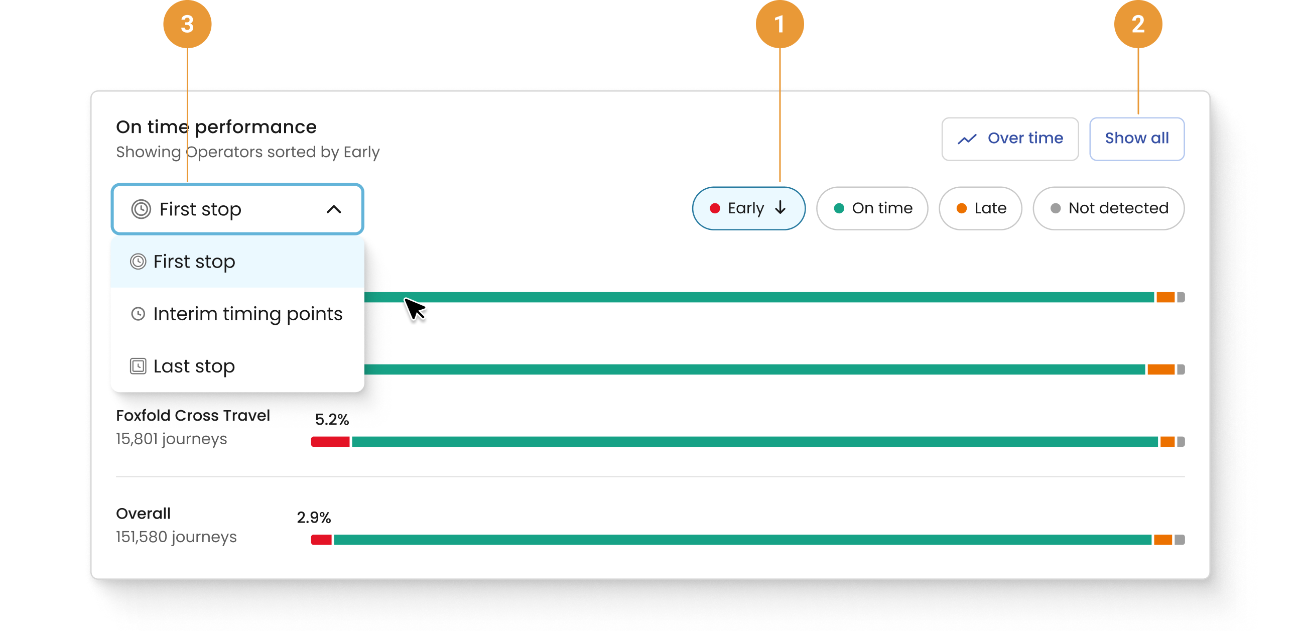
The On time performance chart defaults to showing the three operators or services with the highest percentage of early First stop times for the selected filters as well as the overall percentage of journeys that were early.
To view the three operators or services with the lowest percentage of early First stops for the selected filters, click the “Early” button near the top of the container (1). You can also view the three operators or services with the highest/lowest percentage of on-time, late, or not detected First stops by clicking either the “On time”, “Late”, or “Not detected” button.
The On time performance chart hides percentages for the other categories that were not selected. To see these percentages, the corresponding segment of the bar chart can be hovered over, or the corresponding button (for example, “On time”, “Late”, or “Not detected”) can be selected.
The “Show all” button takes you to the appropriate Operators or Services page; selections within this chart will persist (2).
First stop is selected by default. Clicking on the First stop button will reveal a drop-down menu where Interim timing points and Last stop can be selected (3). This will show on-time performance for the selected stop type for operators or services. When switching between stop types, the selection of the “On time”, “Late”, or “Not detected” button will persist.
Before September 4th, 2023, the On Time Performance chart will lack data or appear unusual because it began collecting data on that date.
All charts reflect the date range selected, including excluded dates. Specifically, when exclusions have been applied for particular date(s), those will appear in the horizontal axis, but no data is shown in the chart.